Aster — Classic Italian Serif for Finely Set Text
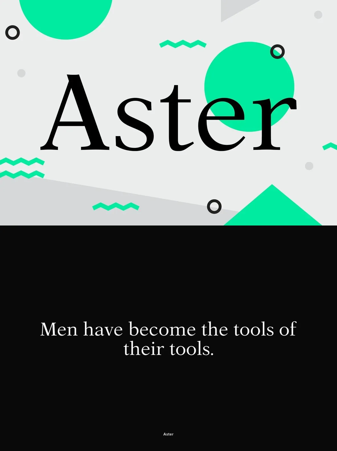
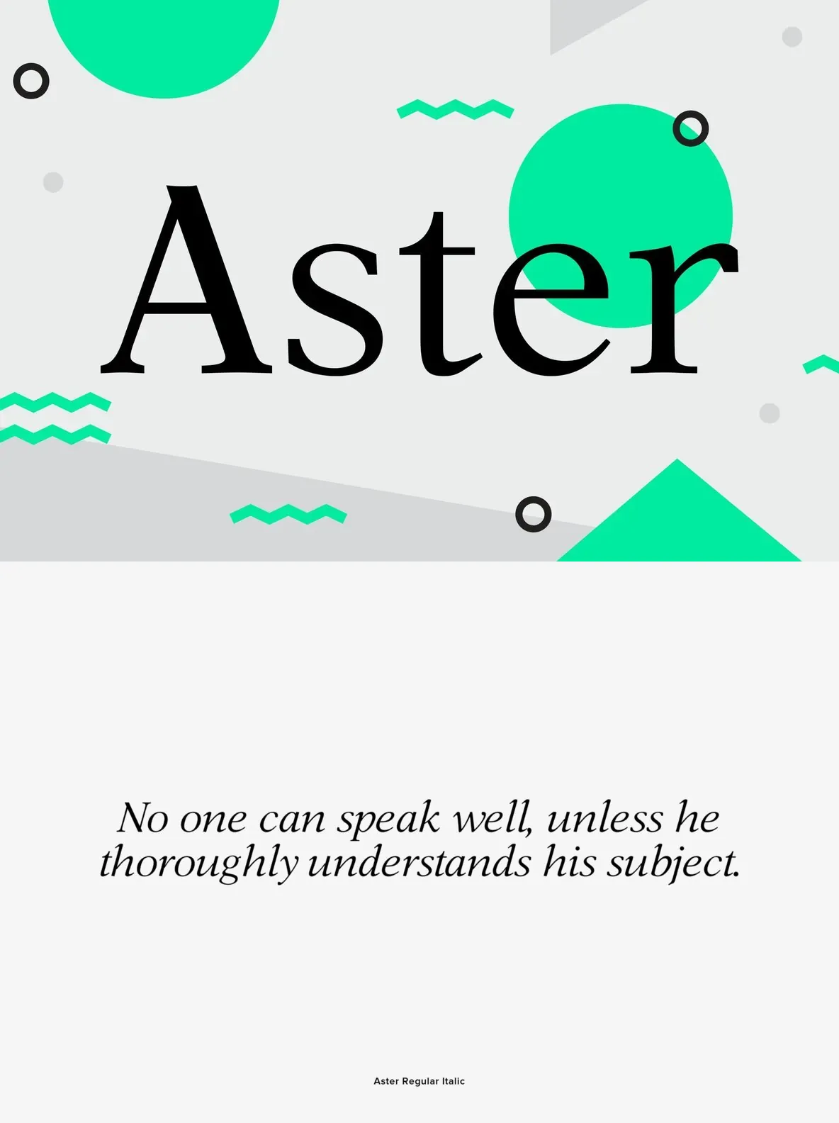
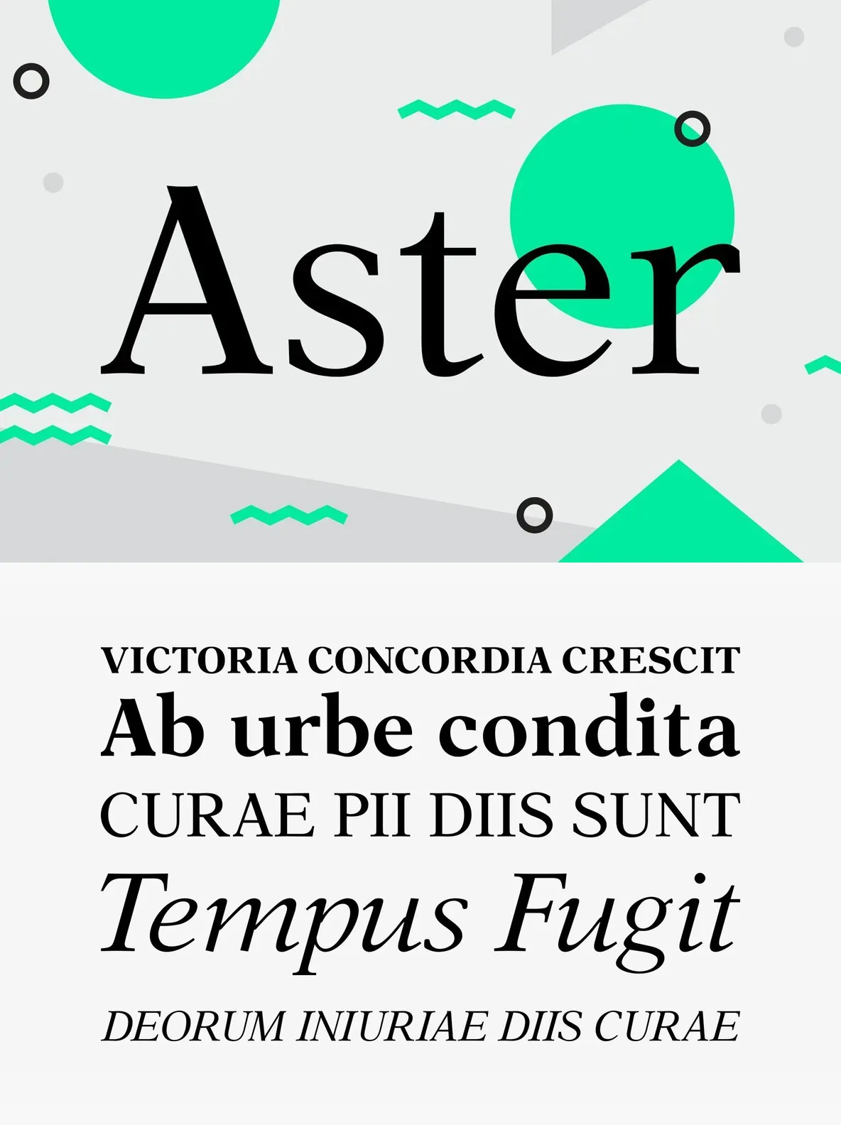
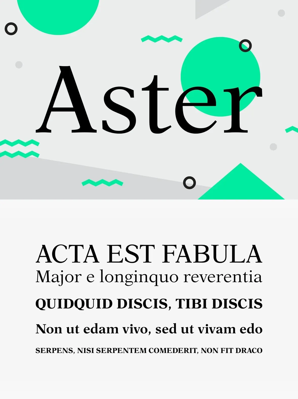
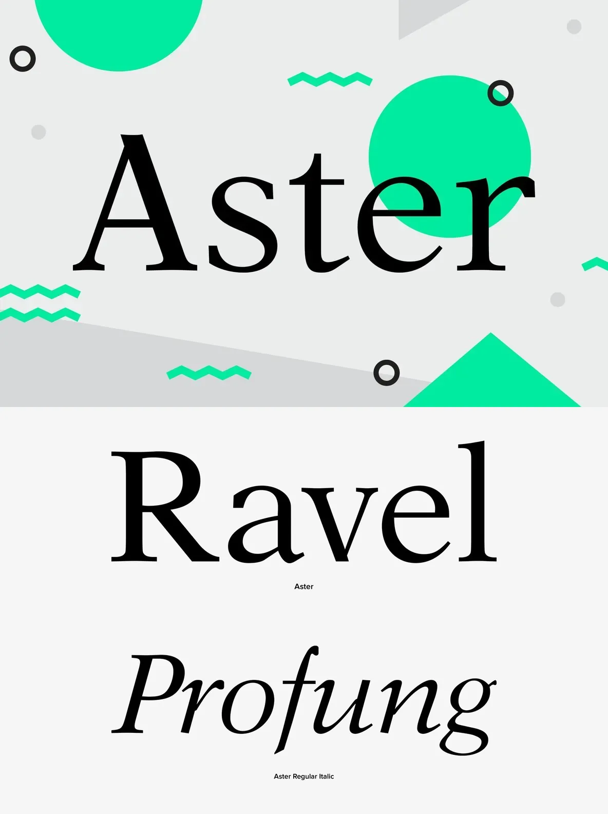
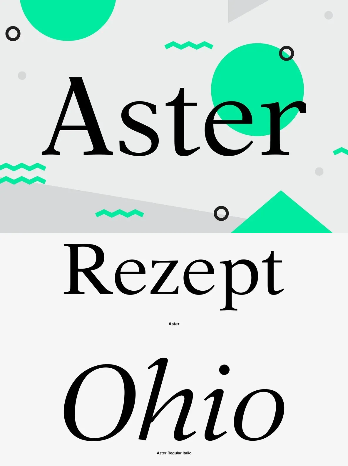
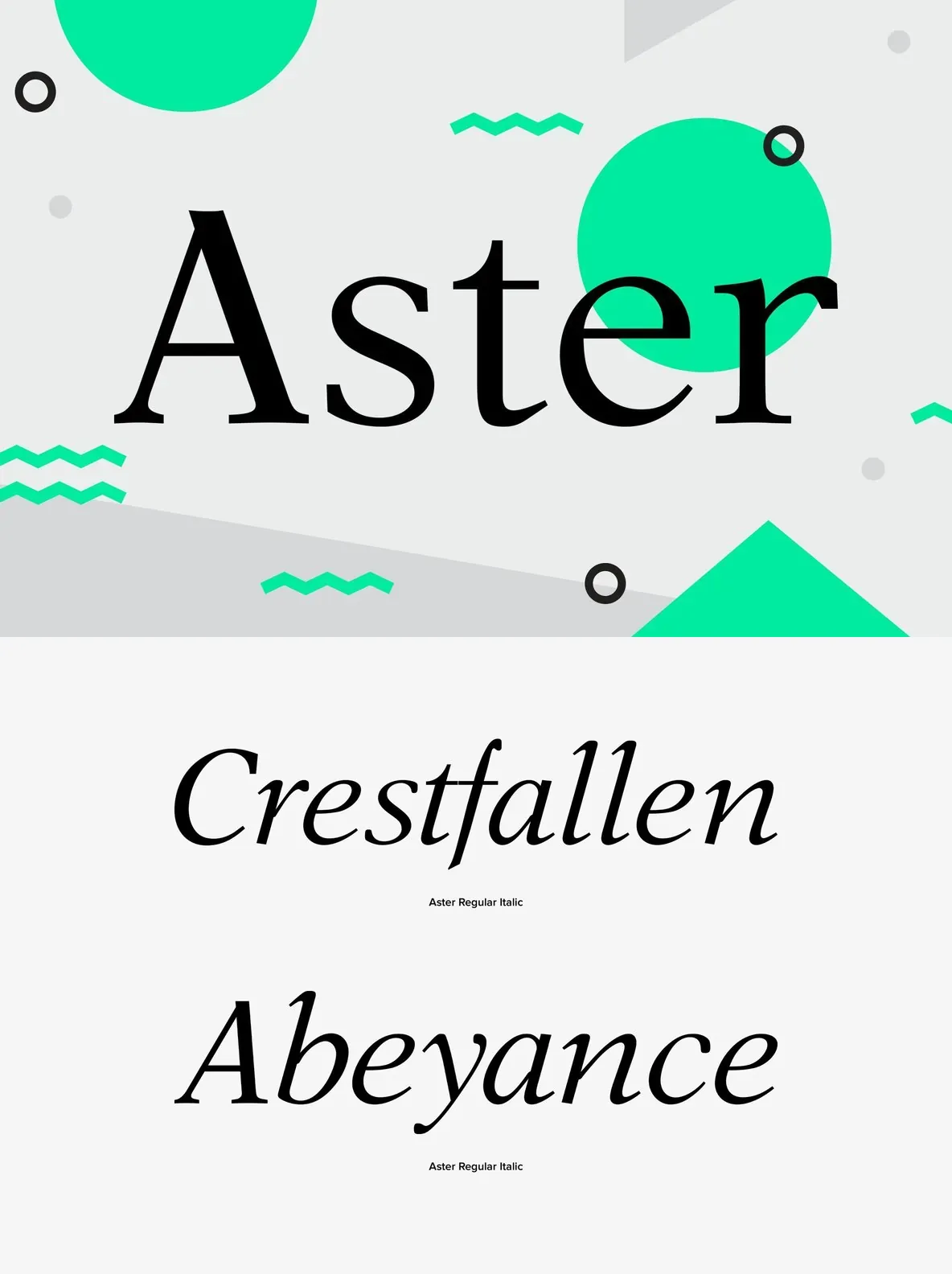
Aster, created in 1958 by Italian designer Francesco Simoncini, stands as a staple in the world of serif typography. Its origins in the Simoncini type foundry in Bologna reveal a deep-rooted heritage, designed specifically for text-rich environments like newspapers and books.
The structure of Aster promotes exceptional legibility, making it a reliable choice for extensive reading. With its refined serifs and carefully balanced letterforms, this typeface ensures clear communication on every page. Designers seeking a timeless serif that performs under demanding print conditions will find Aster’s character and quality enduring.
Key Features
Designed for editorial and book typography
Clear, balanced letterforms for easy reading
Celebrated Italian design heritage from the 1950s