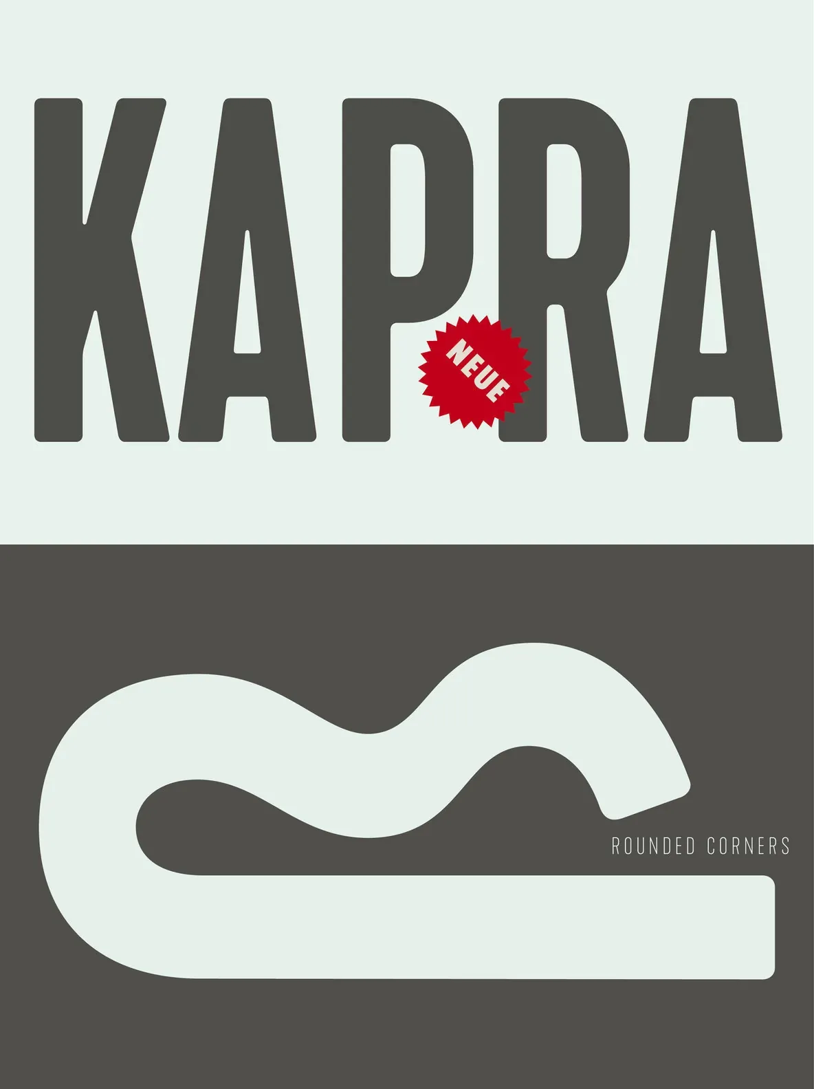
Kapra Neue: Crisp Editorial Range, Quiet Authority
A contemporary extension of the original Kapra family, Kapra Neue introduces refreshed proportions, softened corners, and reimagined glyph shapes. It covers a wide range of typographic needs with 24 distinct weights, from Thin Condensed to Black Expanded. Every weight includes a matching italic, giving designers precise control over tone and hierarchy across layouts.
The family supports the Latin script and includes old-style figures, making it suitable for both text and display use. Kapra Neue takes inspiration from You And Me Monthly magazine, published by National Magazines Publisher RSW Prasa in Poland between May 1960 and December 1973. That reference brings a grounded, editorial character to contemporary work—especially branding and editorial projects where subtle sophistication matters. Designed by Typoforge Studio.
Features
24 weights covering Thin Condensed to Black Expanded
Italic versions for every weight
Latin script glyph set
Old-style figures for refined typography