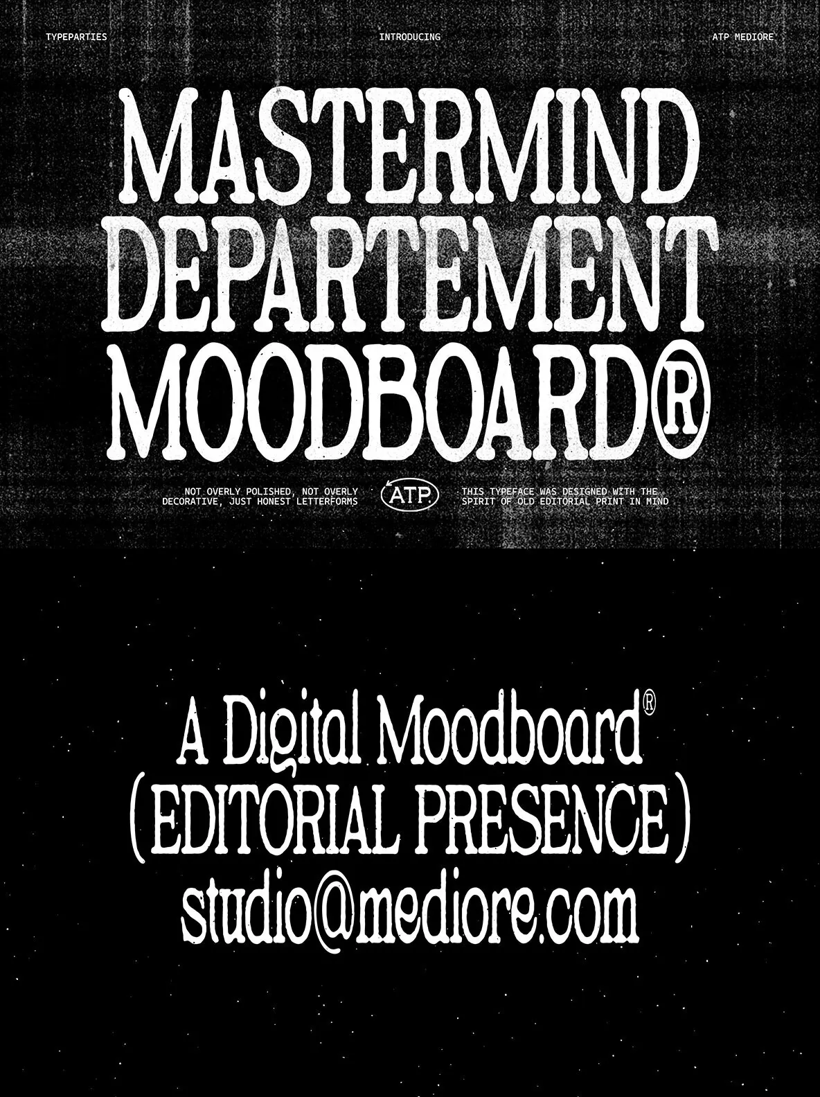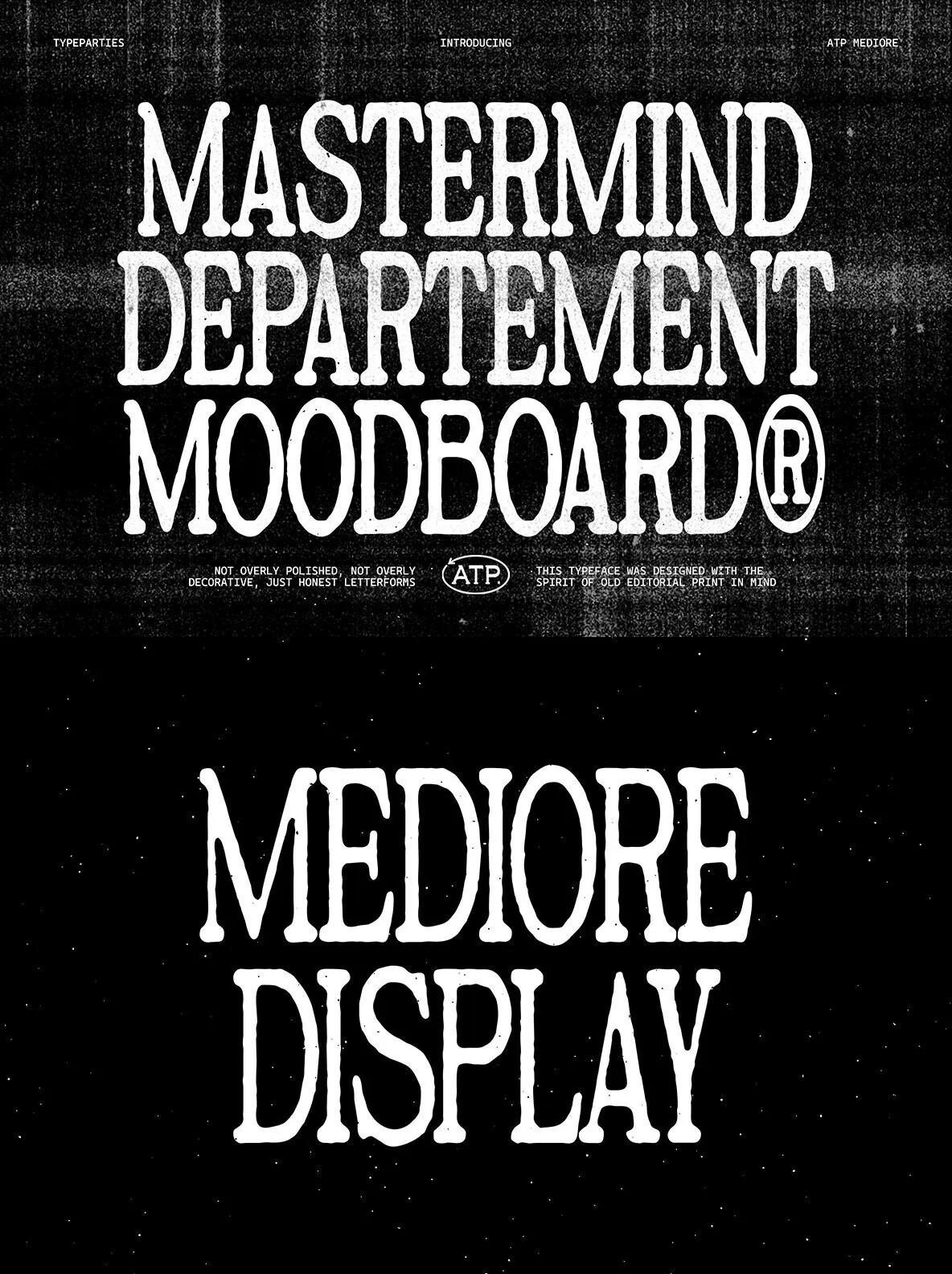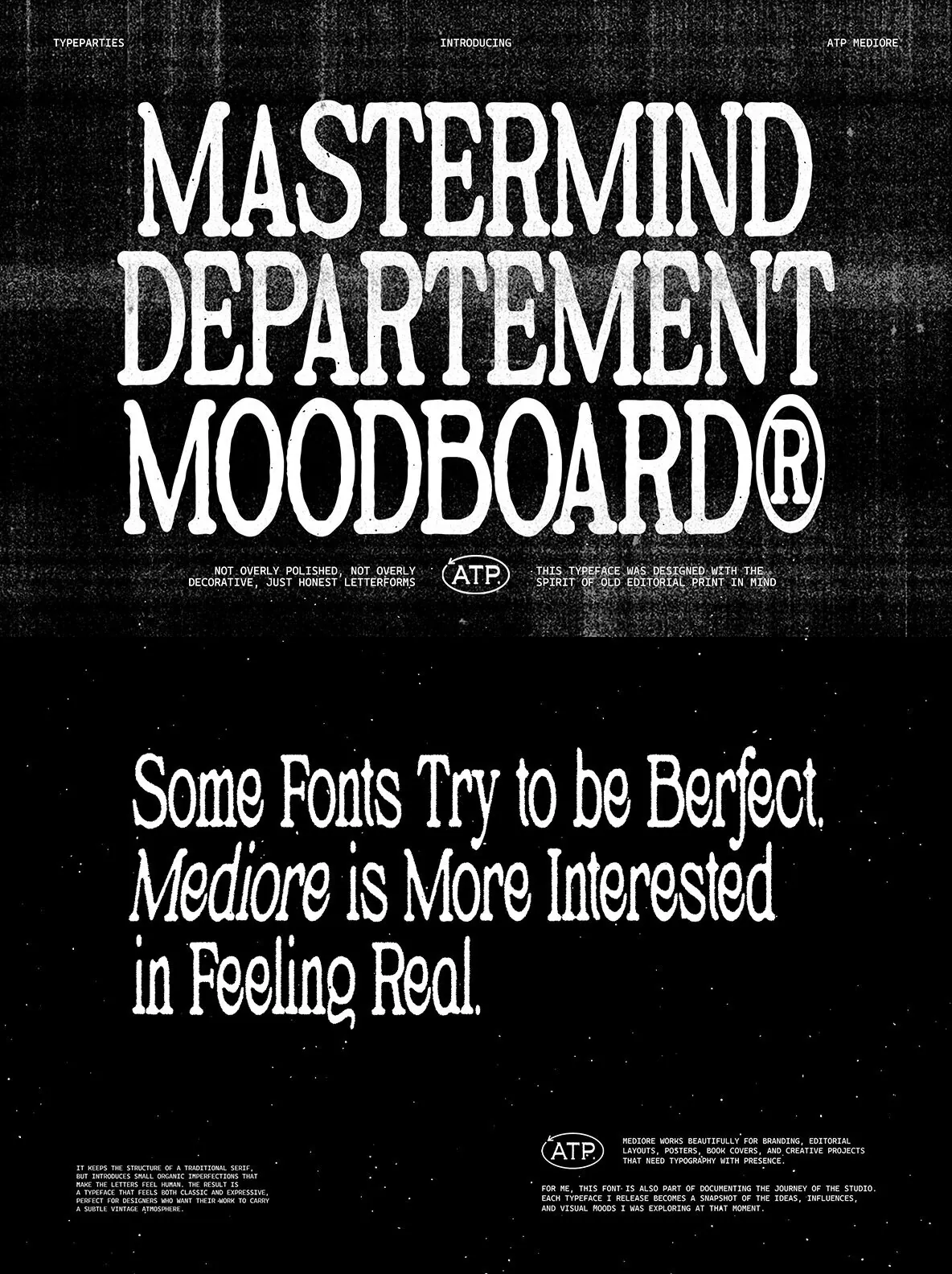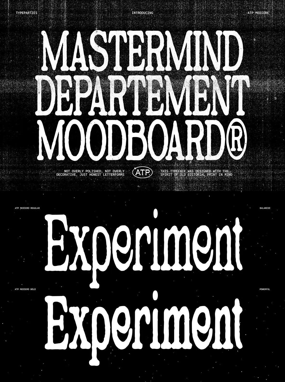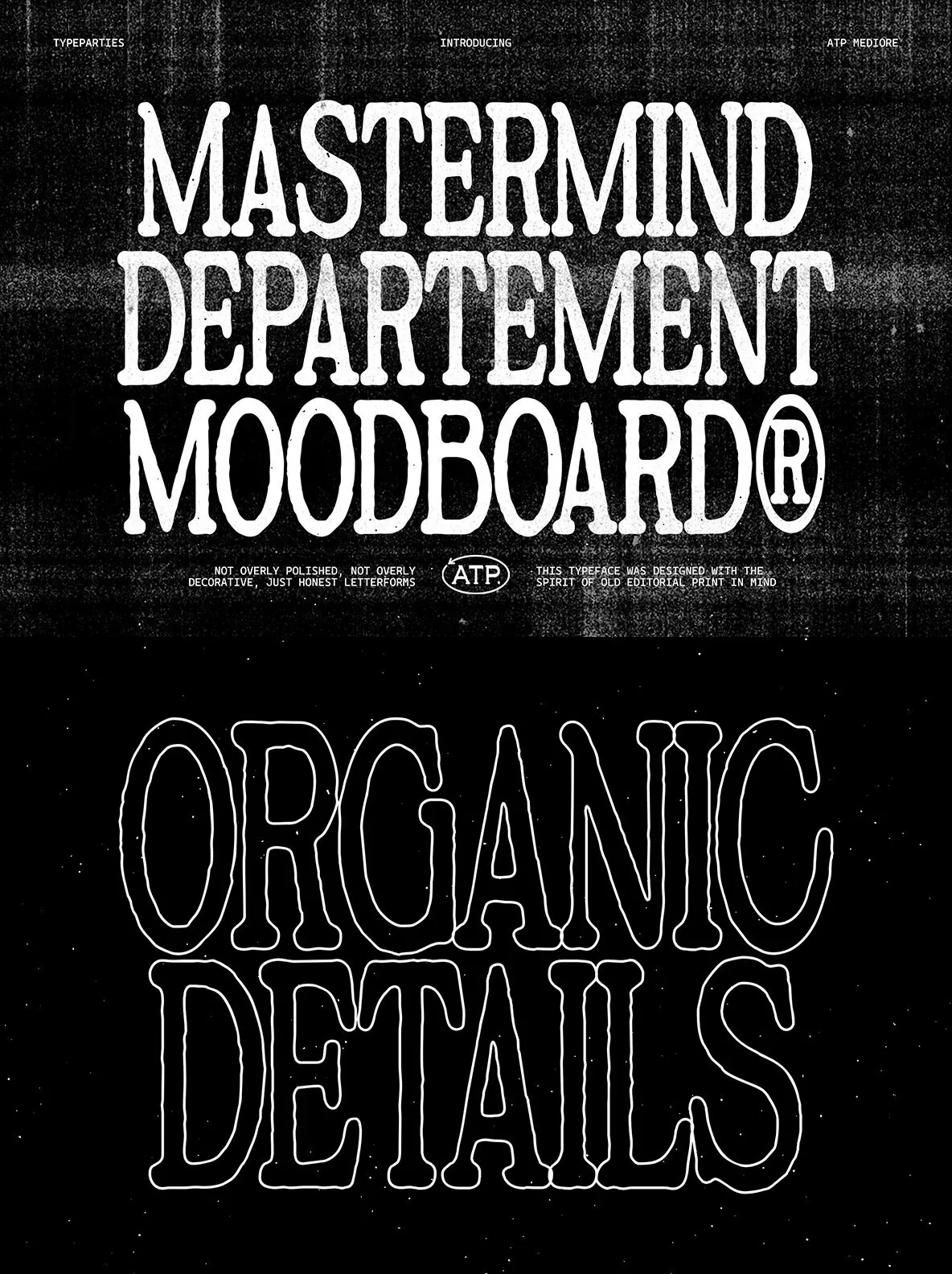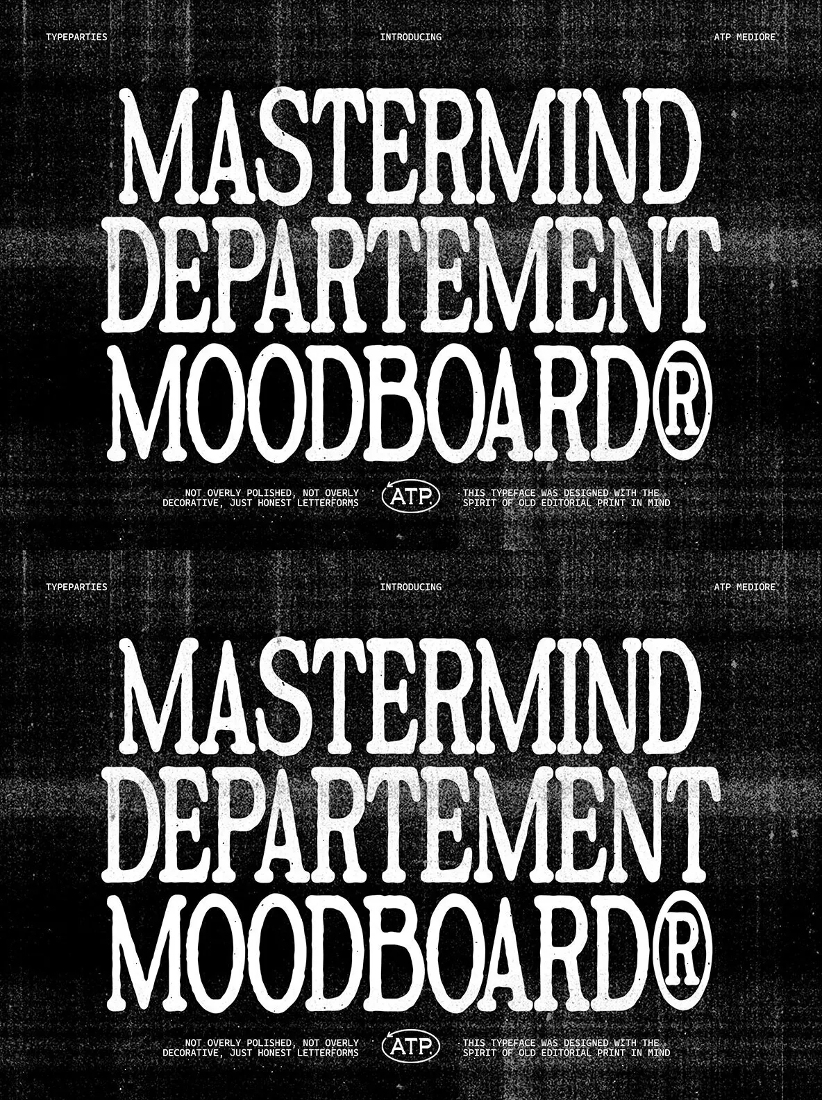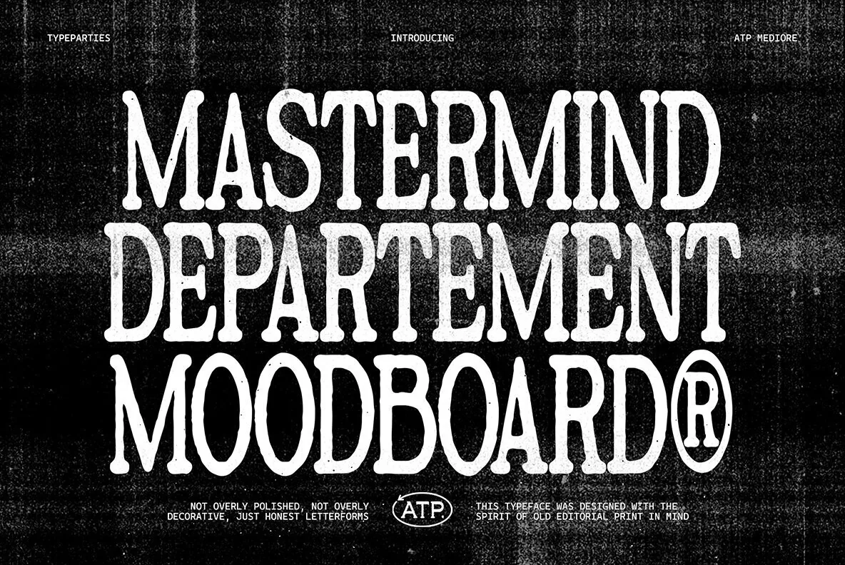
Mediore — Editorial Grit in Serif Form
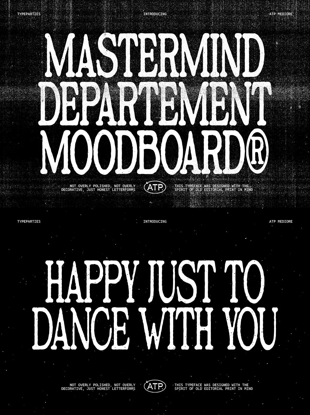
Mediore was designed with the spirit of old editorial print in mind. It recalls the typography found in vintage magazines, worn book covers, and underground posters, where the ink never appears completely perfect. Every curve carries a subtle organic texture, giving the letters a human presence and the feeling of type printed from an old press, then found years later.
Mediore sits between classic serif tradition and raw independent design culture. Its structure feels timeless, while its personality moves toward something more expressive. It works beautifully for designers who want typography to feel thoughtful, artistic, and slightly nostalgic, without losing modern clarity in editorial layouts, poster design, branding, and expressive visual work.
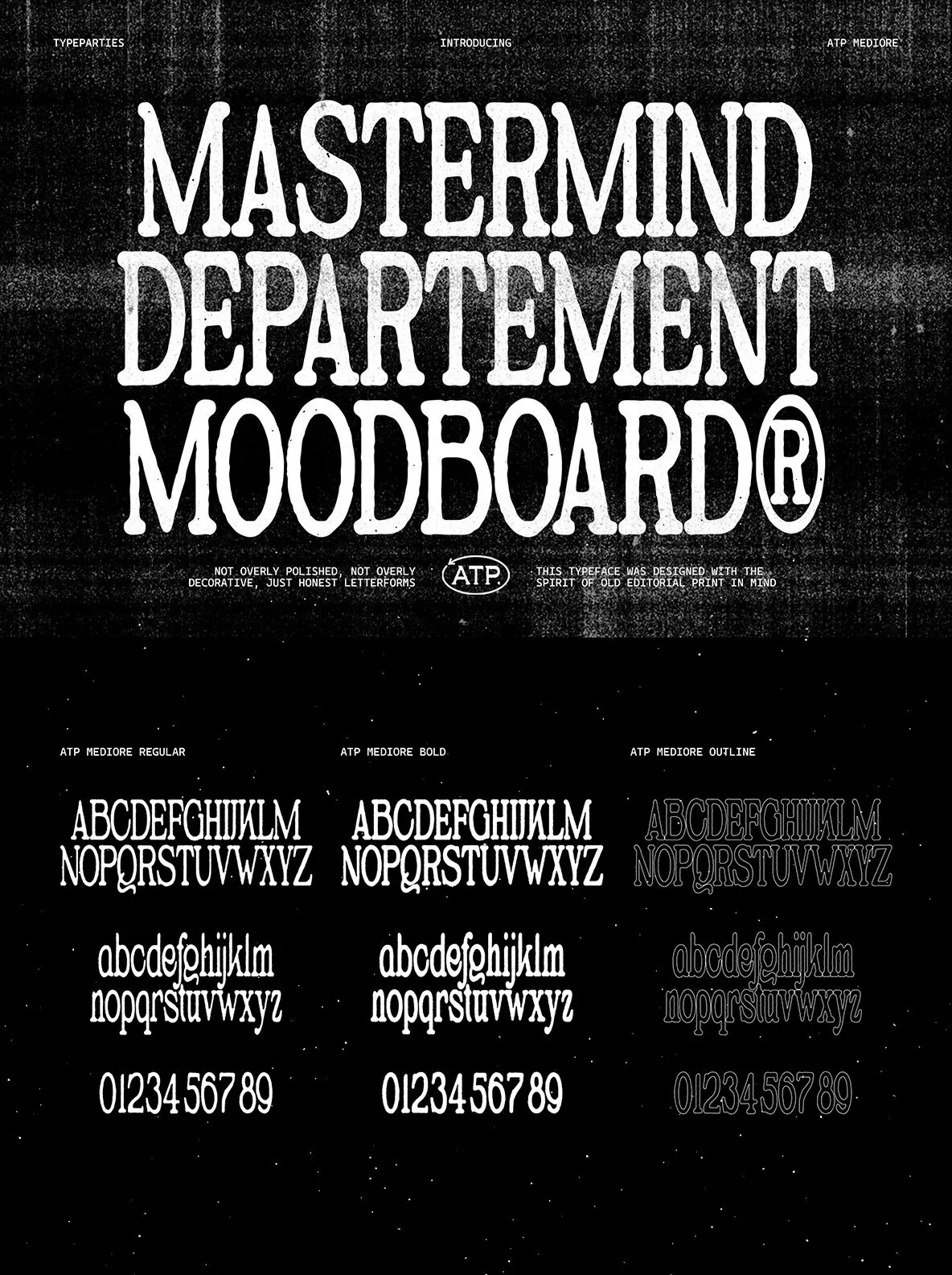
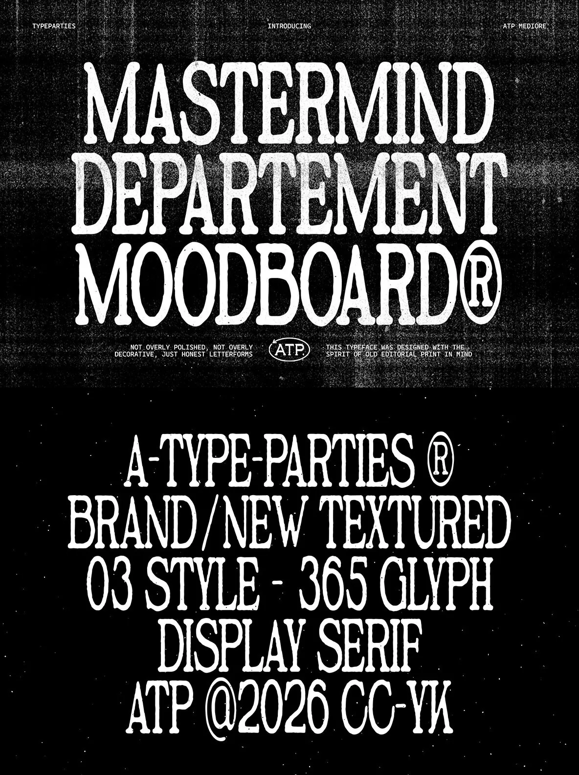
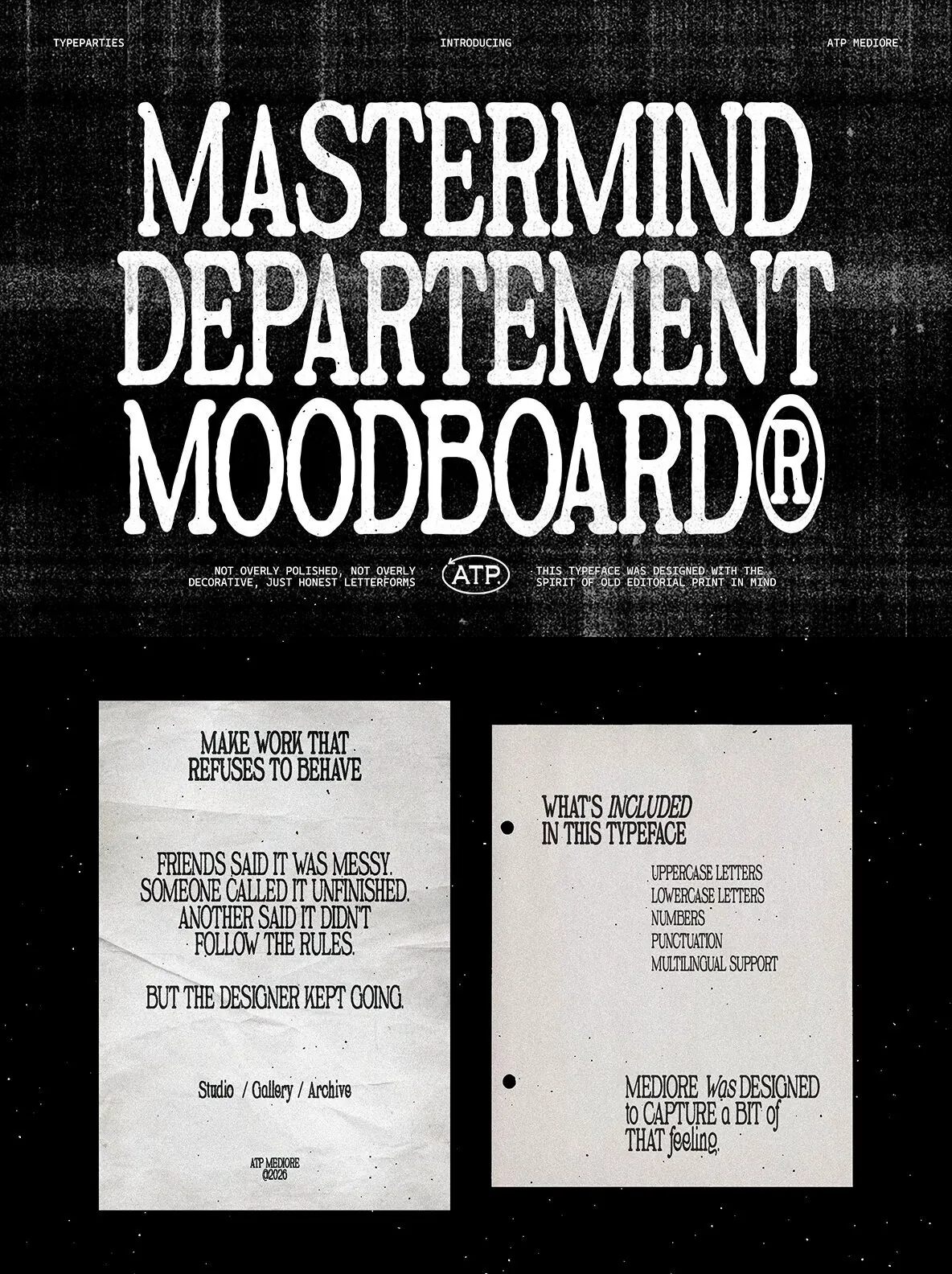
Features
Uppercase
Lowercase
Numerics
Punctuation
Multilingual