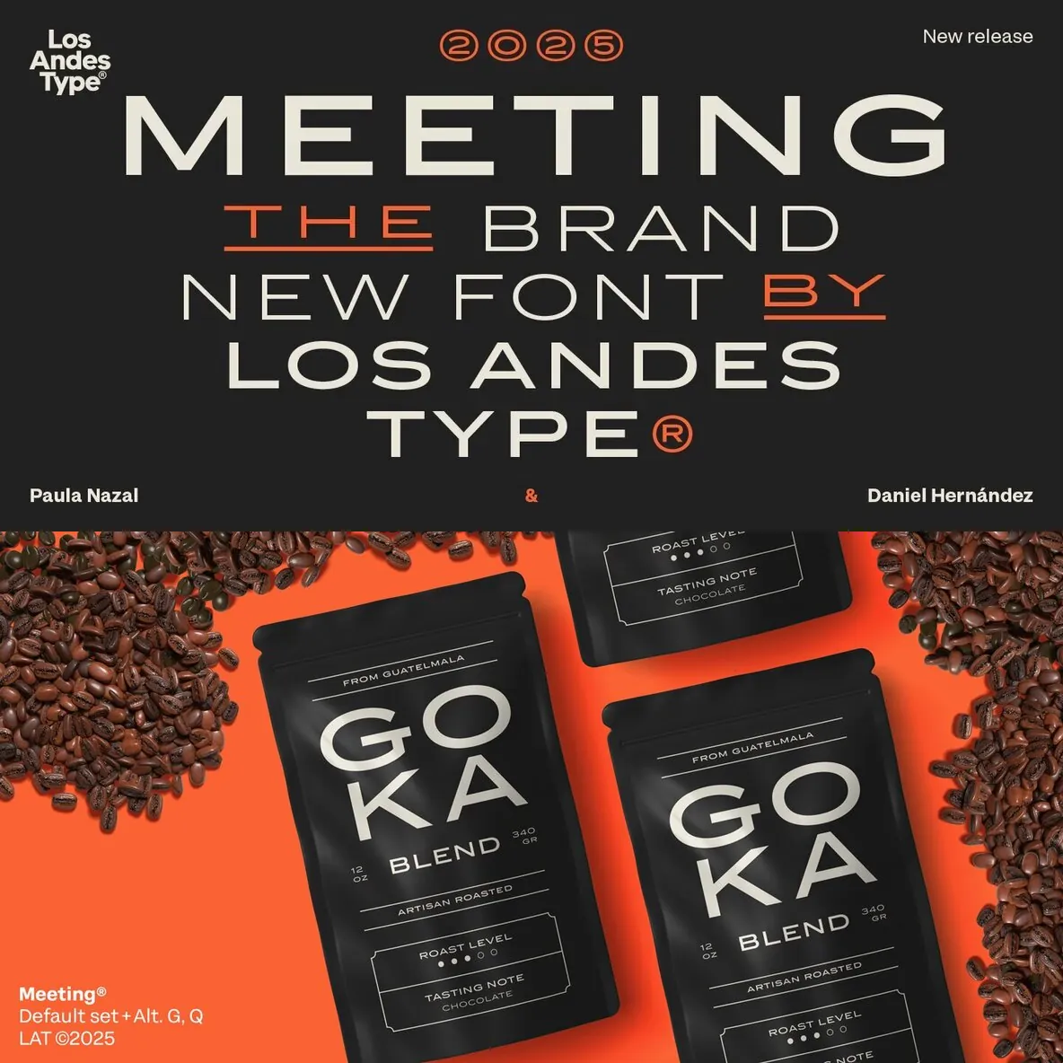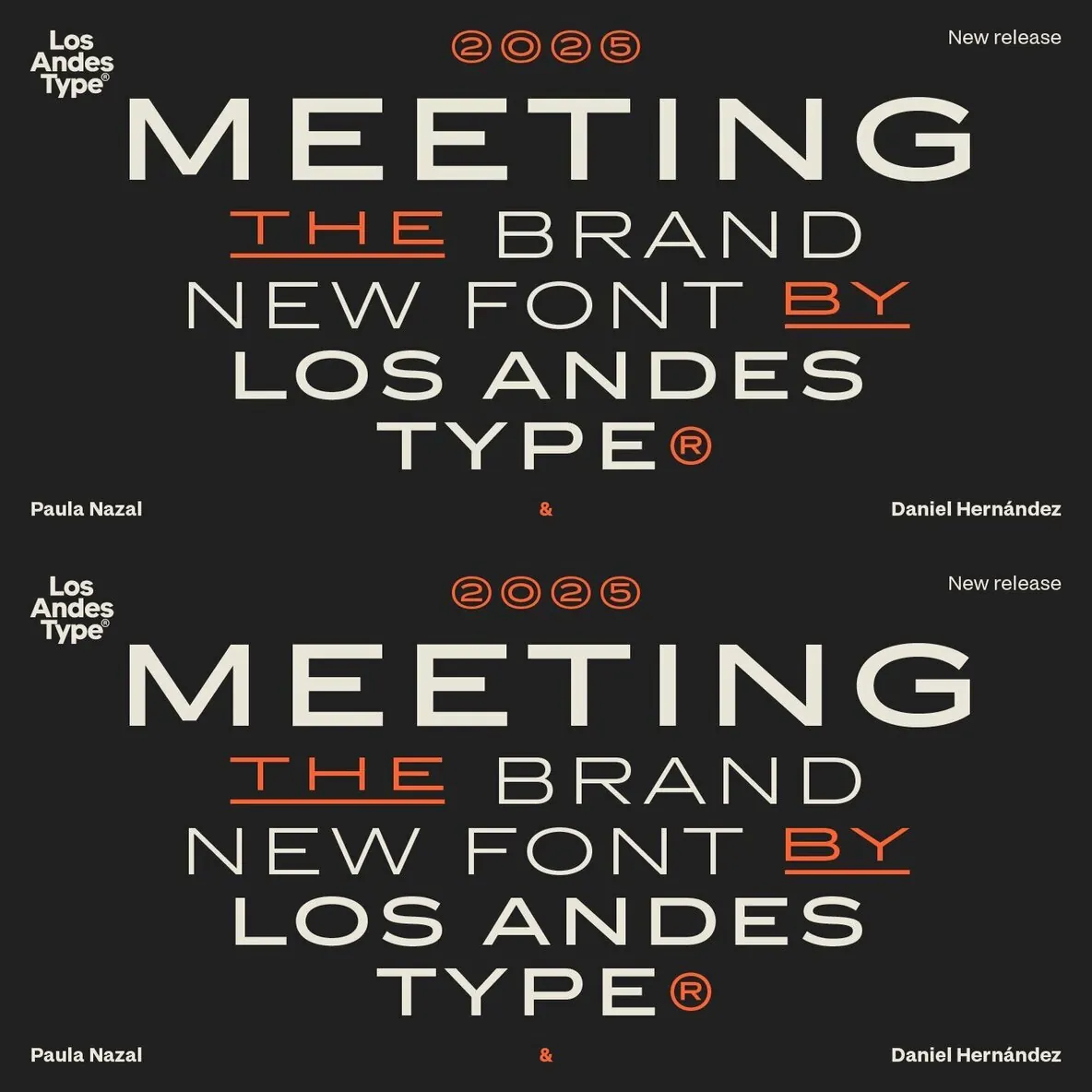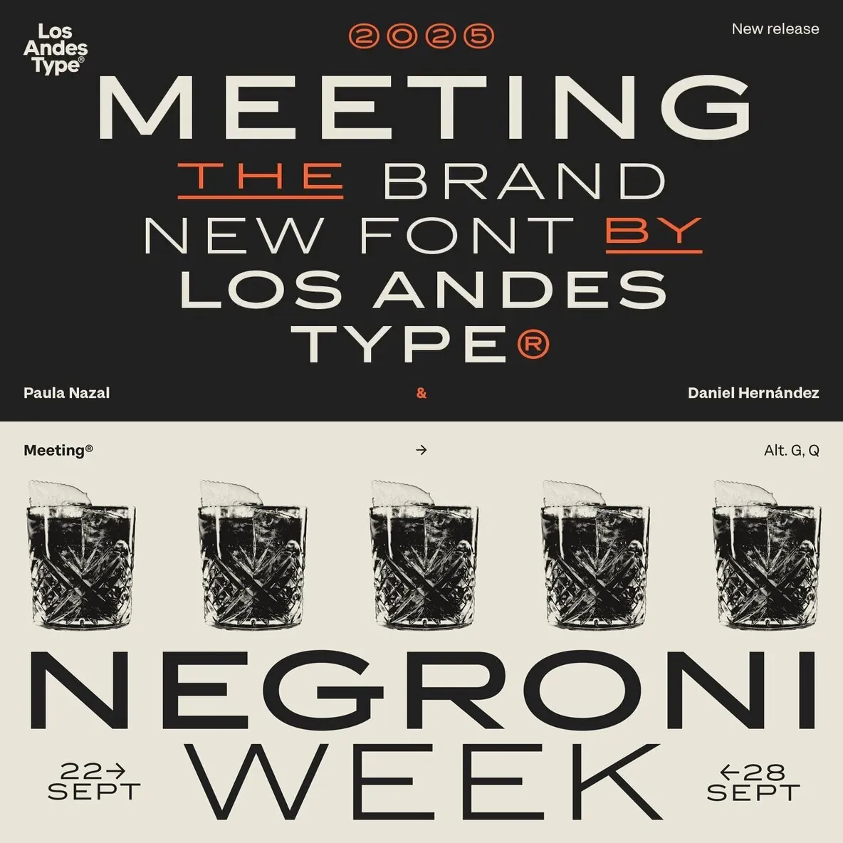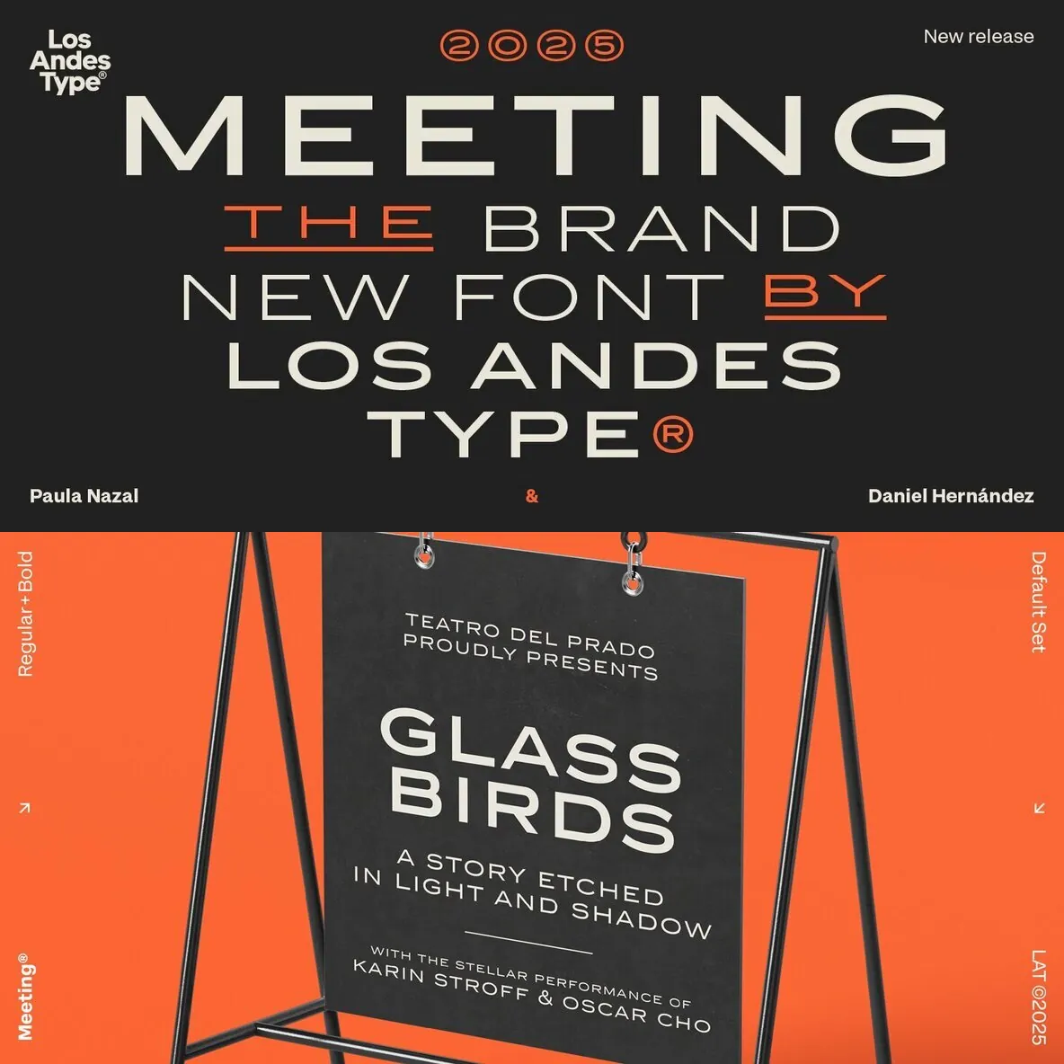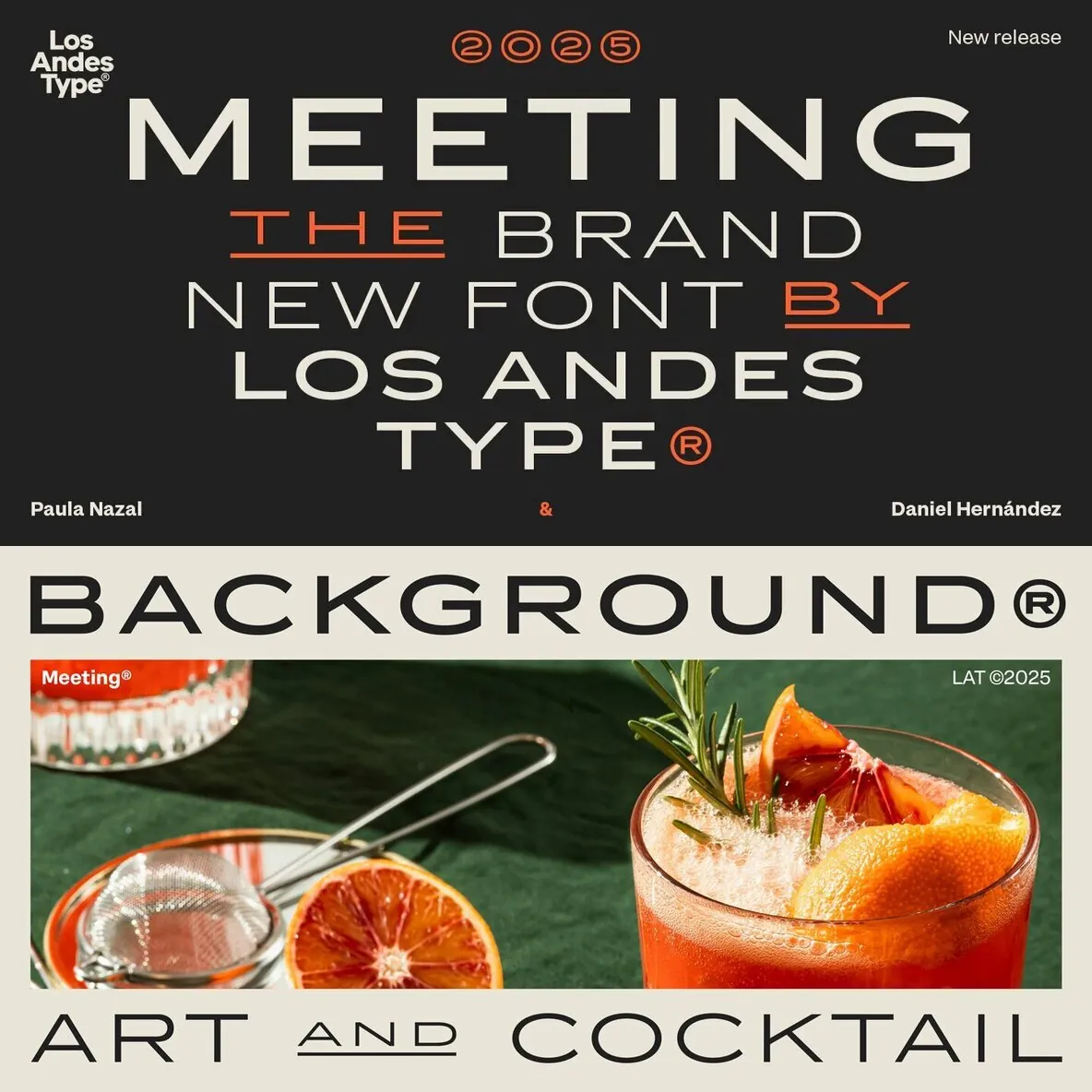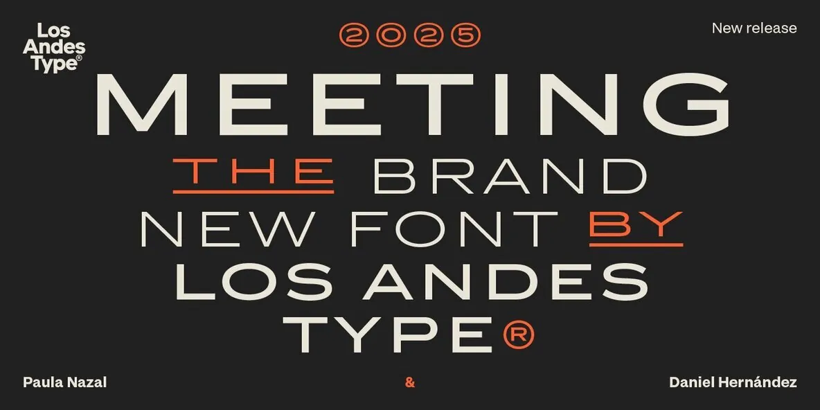
Meeting — Spacious caps, quiet authority
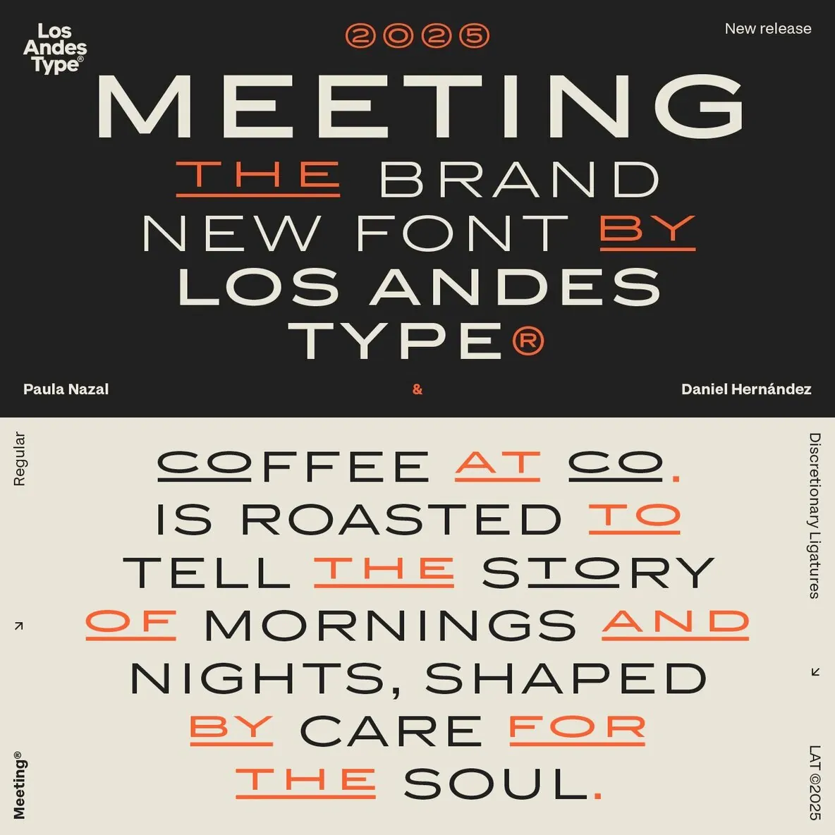
A sans serif typeface distinguished by wide capitals and firm proportions, Meeting draws on the sober tradition of Copperplate Gothic. It reinterprets that influence with a contemporary, more relaxed sensibility. Generous spacing lets each word breathe, supporting clear readability and balanced layouts across print and digital typography.
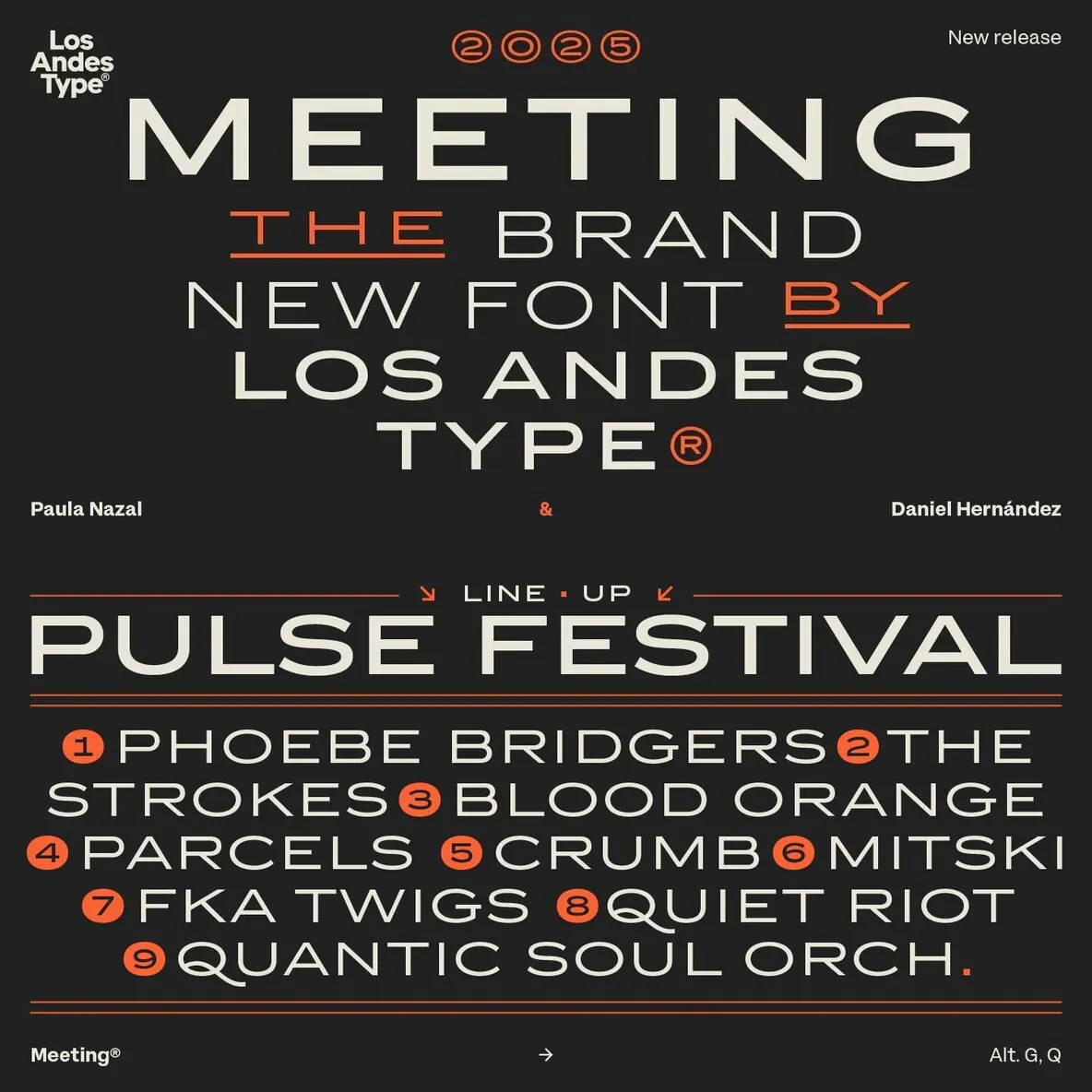
Constructed from solid shapes and clean strokes, it shows precise curves and well-defined cuts. The visual weight reads with quiet confidence, and it reinforces the value of deliberate pauses in text—especially in short lines, labels, and display settings.
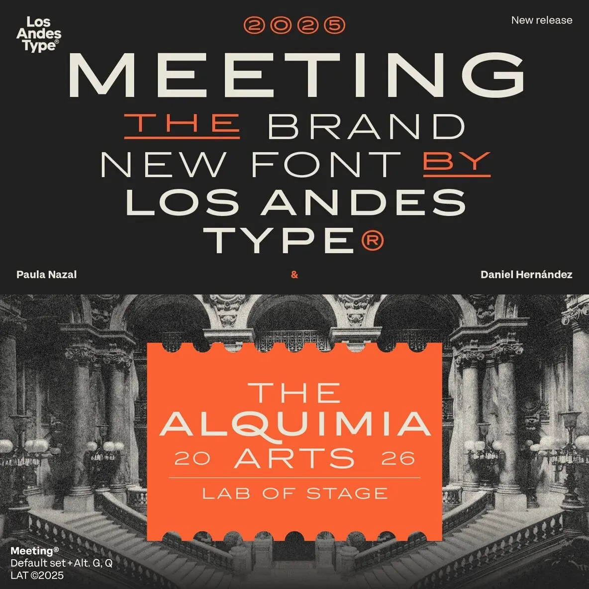
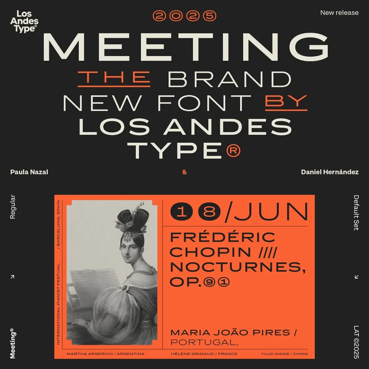
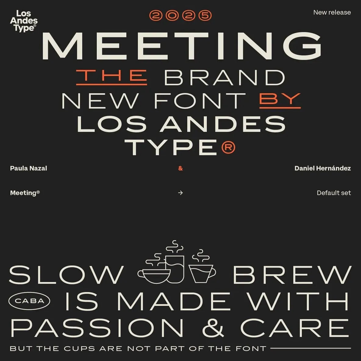
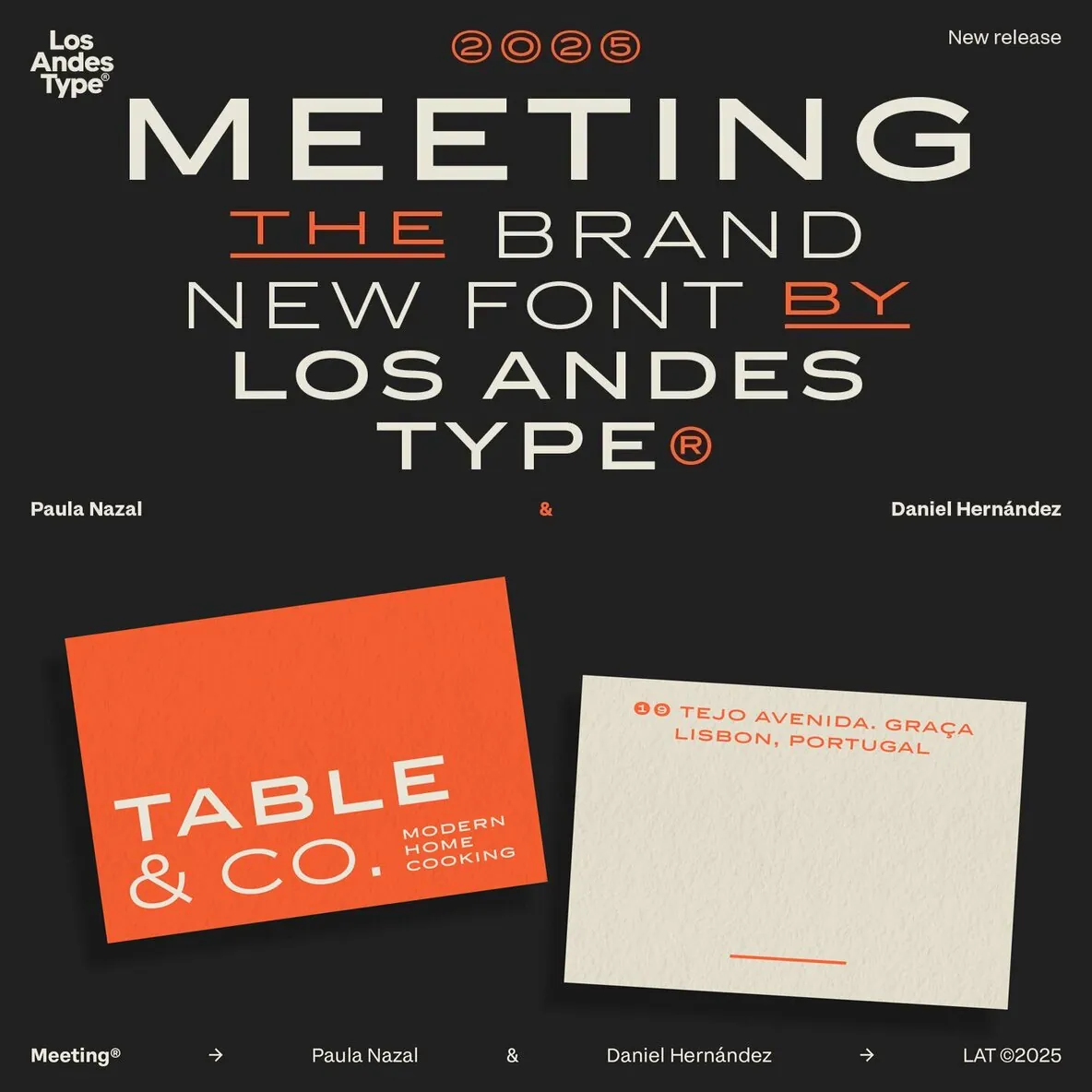
Designed by Los Andes Type, this family fits projects that demand character, from cocktail and coffee labels to festival posters. It also suits menus, music packaging, and handcrafted goods. Meeting balances the seriousness of a refined typeface with a subtle freshness, reminiscent of a well-balanced Negroni cocktail.