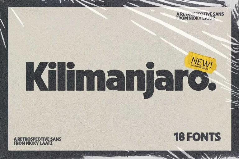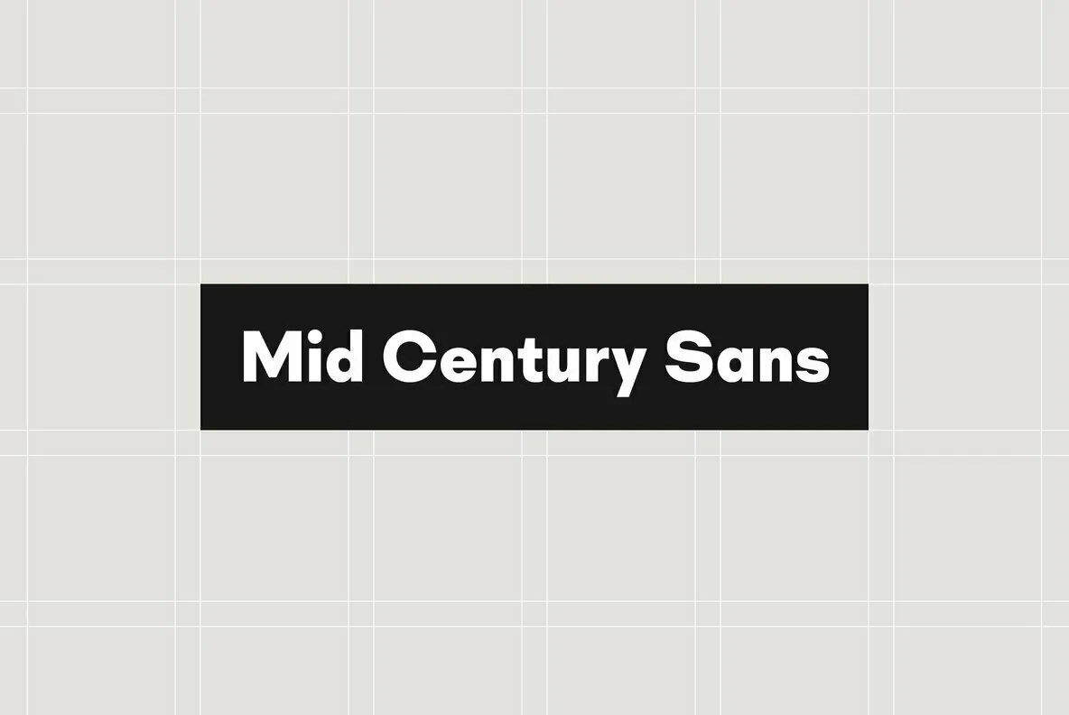
Mid Century Sans: Geometric Clarity in Typography
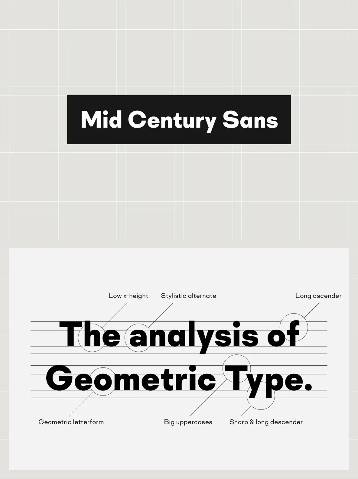
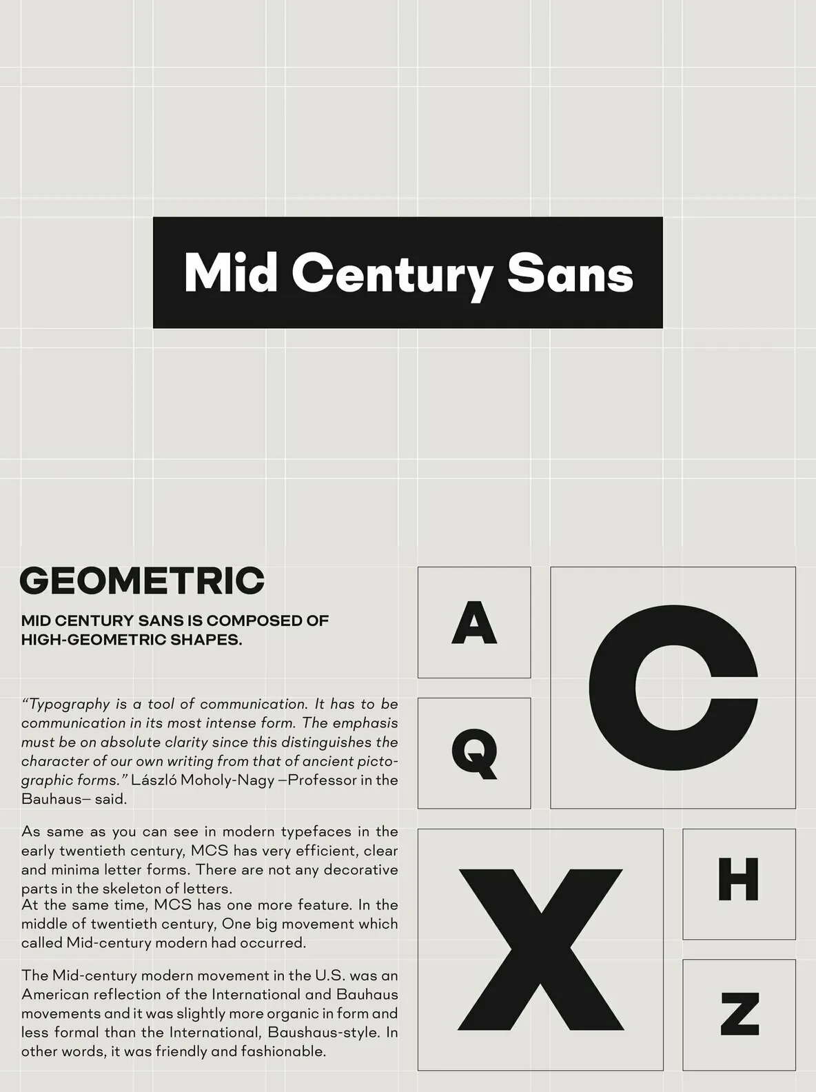
Mid Century Sans captures the essence of precise, geometric design inspired by the Bauhaus movement. This typeface uses high-geometric shapes to deliver clear, focused communication. Its structure echoes the principles set forth by László Moholy-Nagy, emphasizing the role of typography as an effective medium for visual clarity. The clean lines and balanced proportions create a typeface that stands out in editorial projects, branding, and digital interfaces.
Key Features
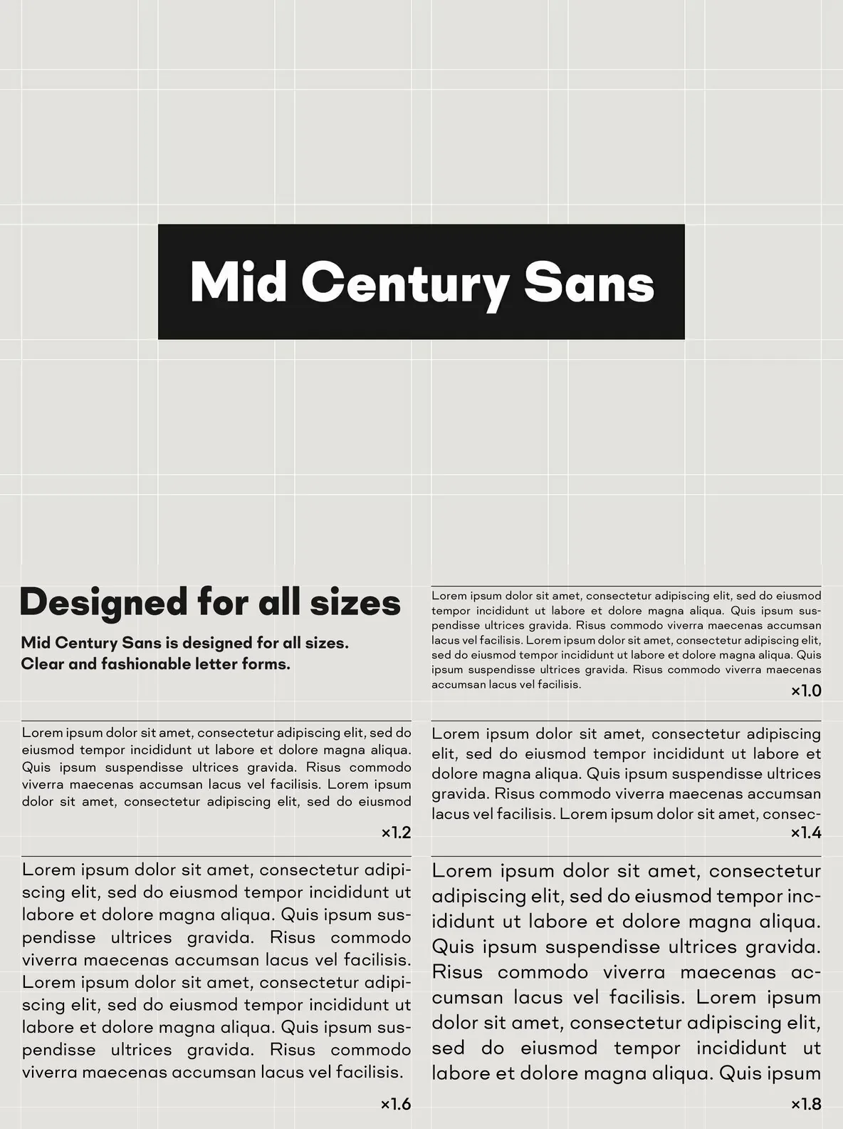
Distinct geometric letterforms ensure strong readability
Versatile style, well-suited for headlines, logotypes, and print layouts
Inspired by classic Bauhaus design principles for a refined, minimalist look
Mid Century Sans pairs functionality with a timeless aesthetic. With its straightforward geometry and modern appeal, it becomes a reliable choice for designers seeking a recognizable and impactful typeface.