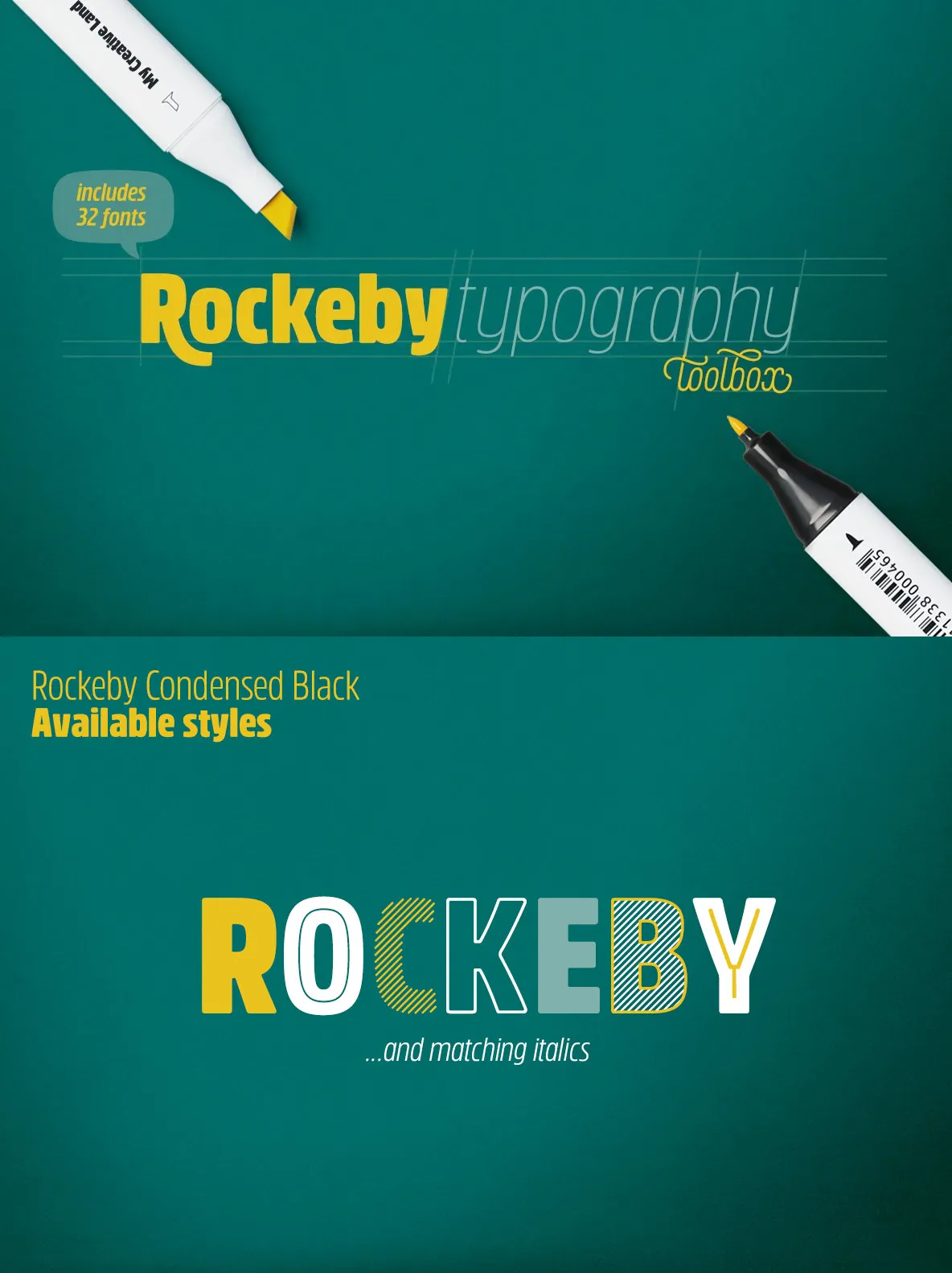
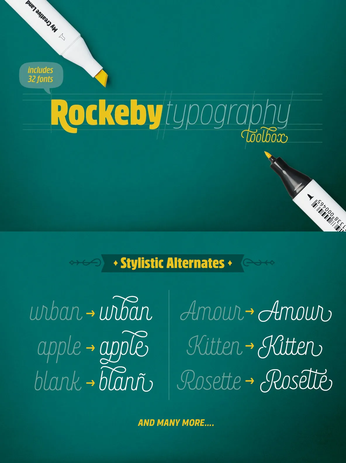
Rockeby — A Soft, Geometric Grotesque
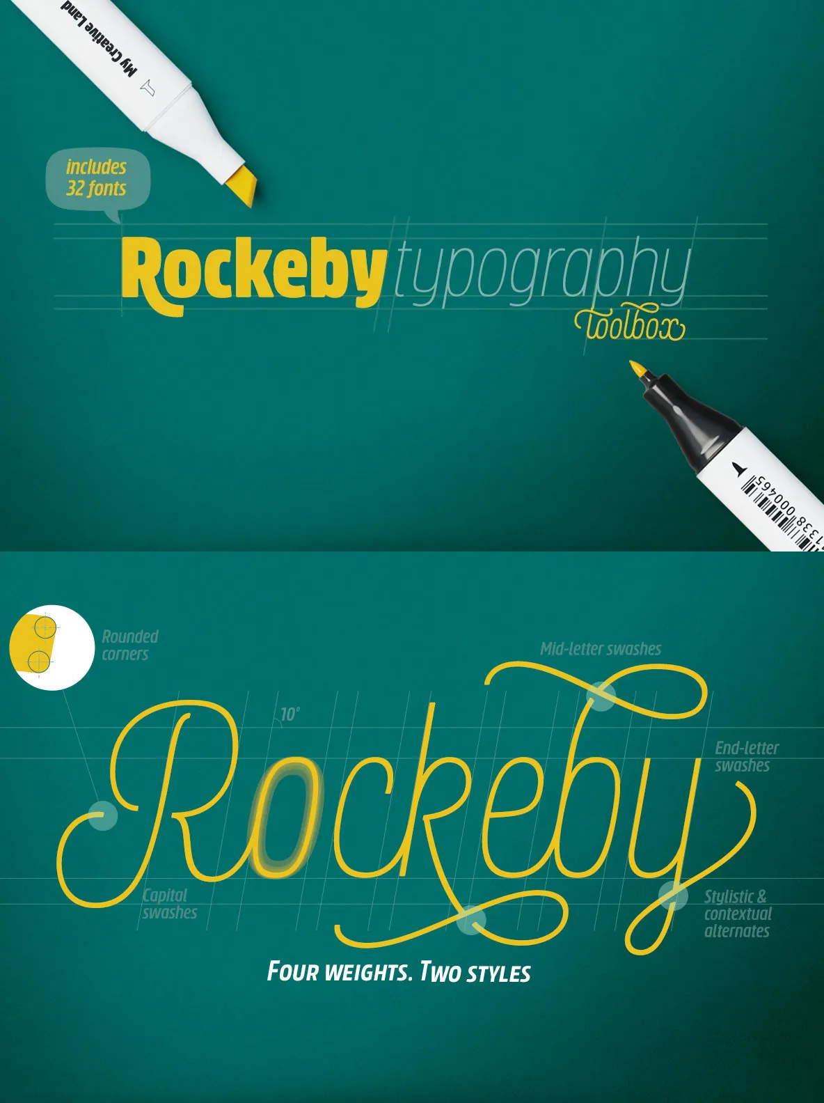
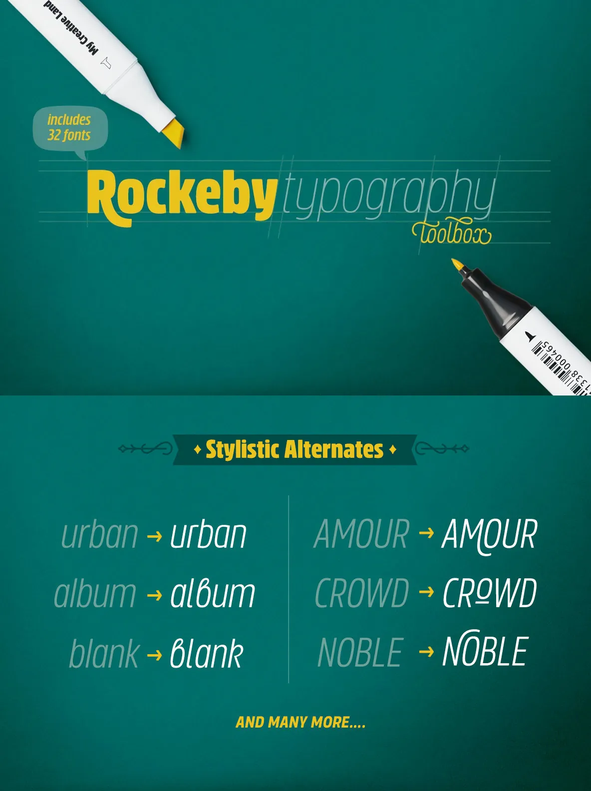
Please welcome the new grotesque family: Rockeby. It is slightly more geometric than Block Berthold, yet much softer than the industrial Din Next. Rockeby includes a lot of stylistic alternates and ligatures to help add character to any type of design. The slightly curved diagonal strokes give the sans serif fonts its unique personality and soft look.
Even more, the family has two scripts (4 weights each) to extend the system further. Combining italics with the script is straightforward because they both share the same italic angle. These scripts also benefit from contextual alternates, slashes, and ligatures. And last but not least, the family also includes Extras fonts (which also have 4 weights) which can further support the design you are creating.