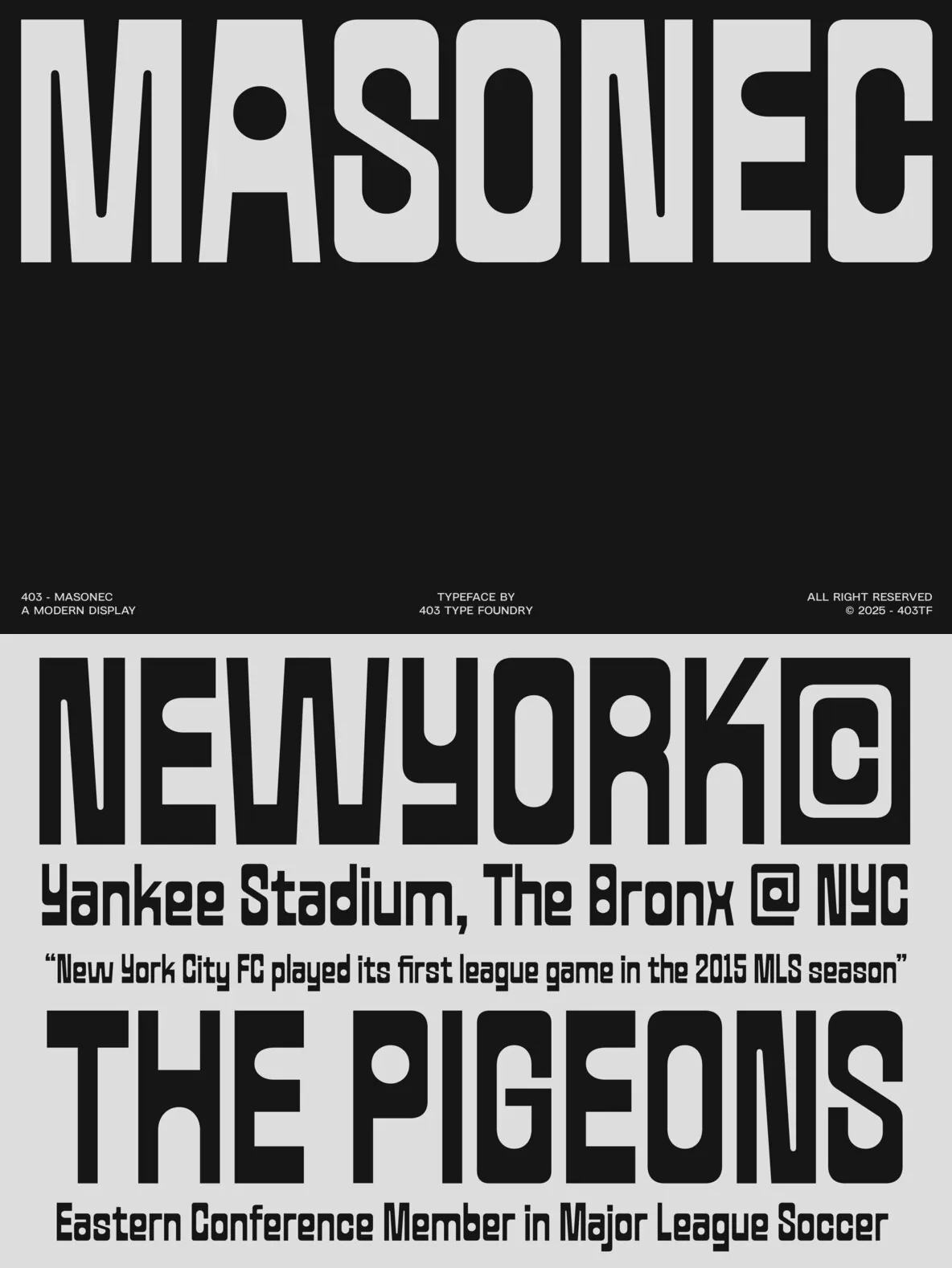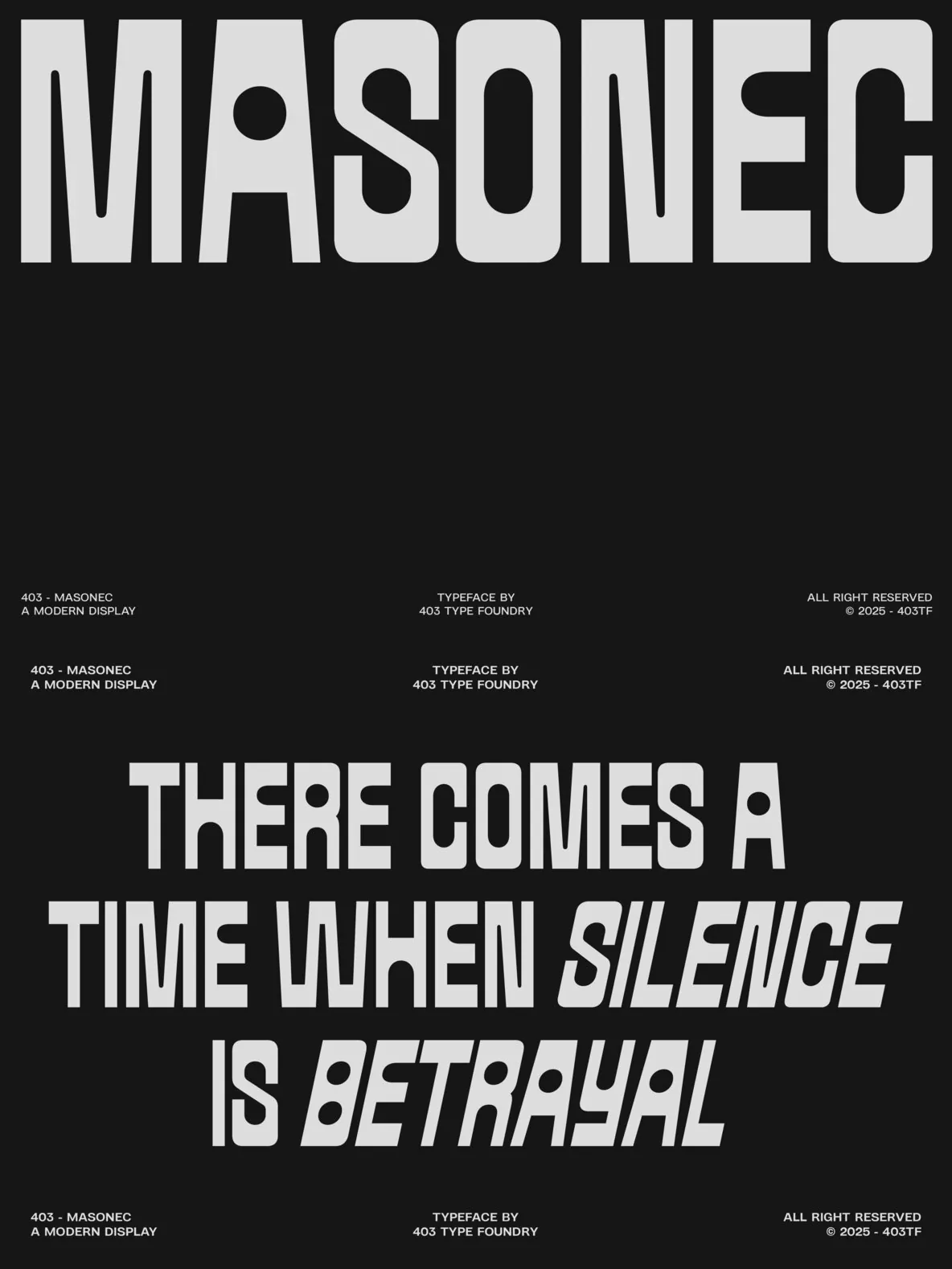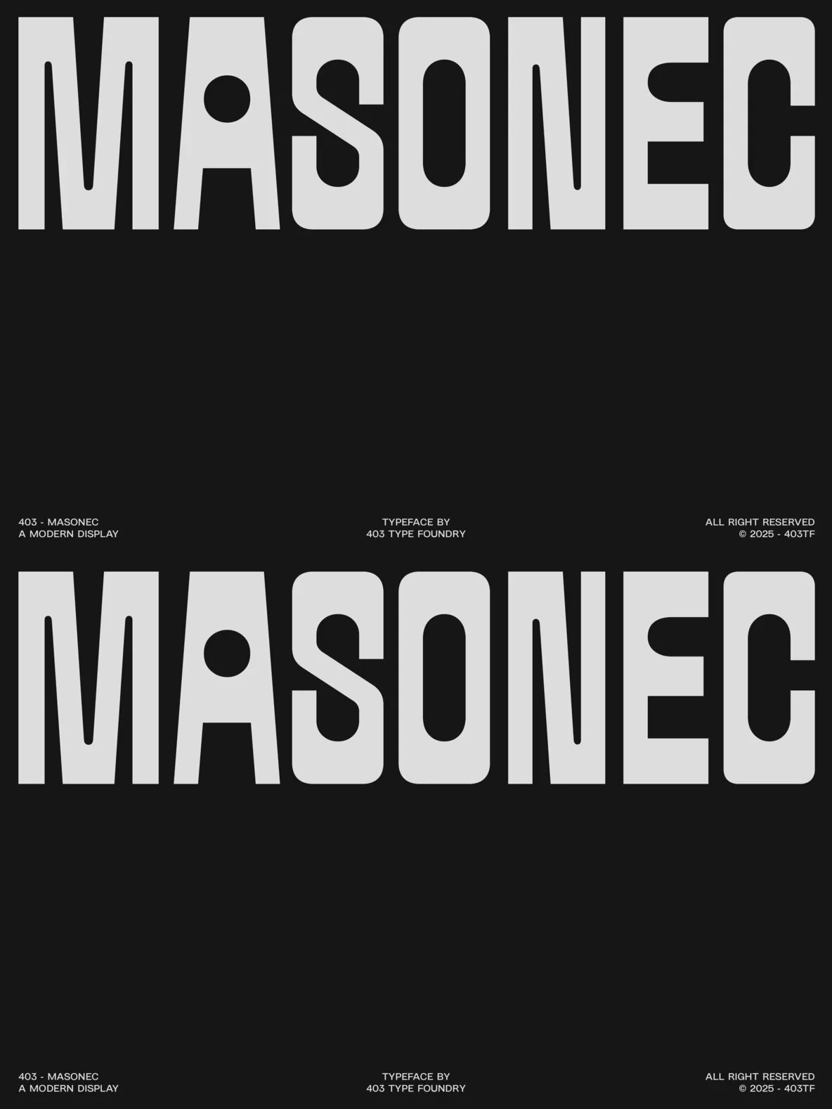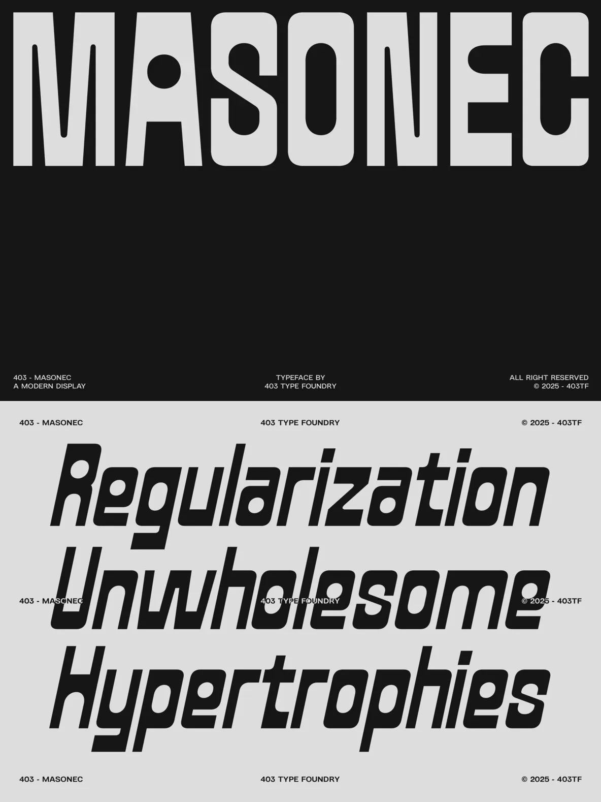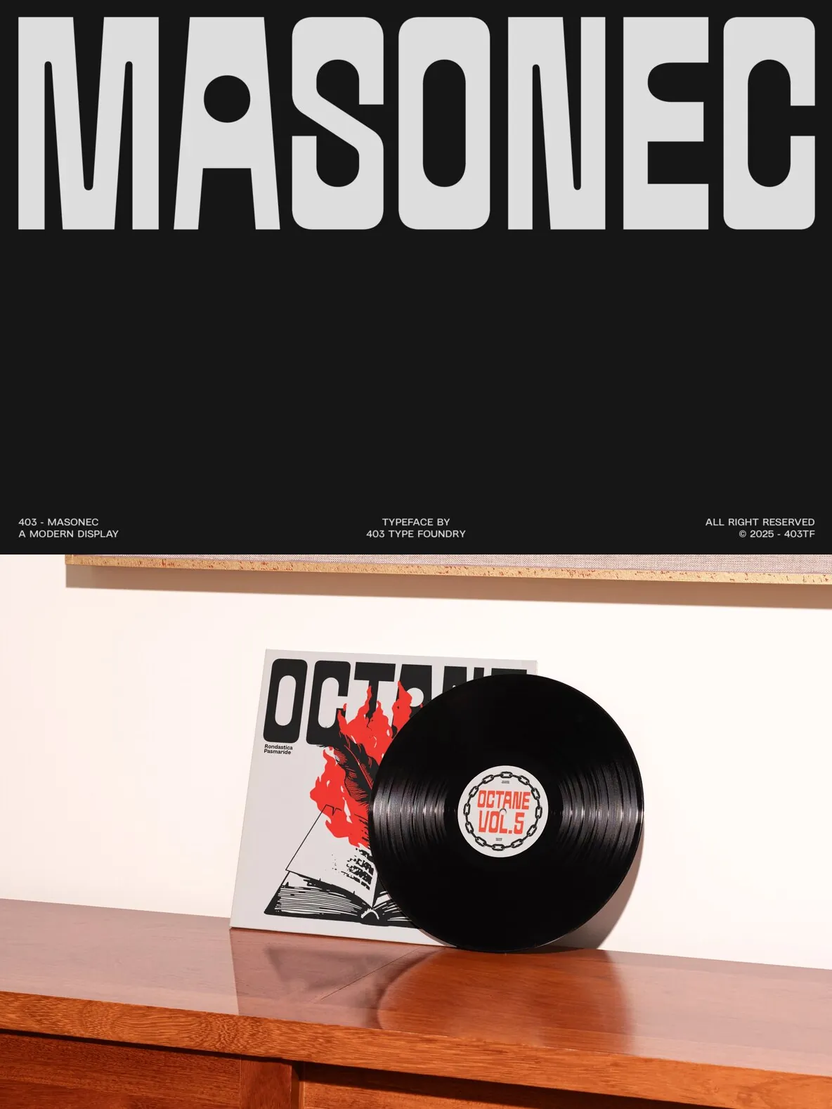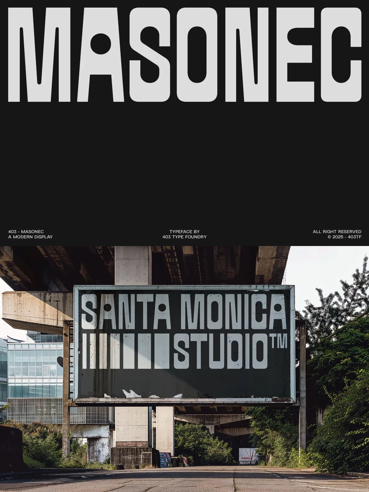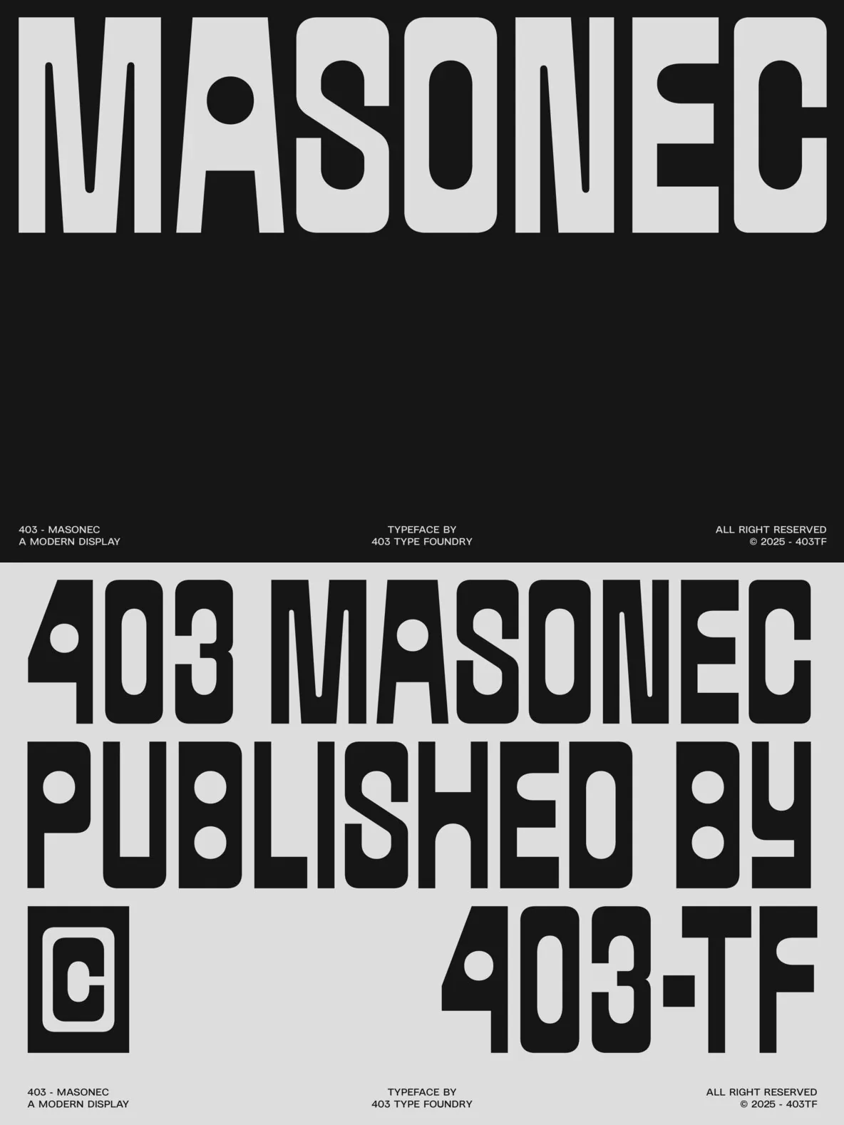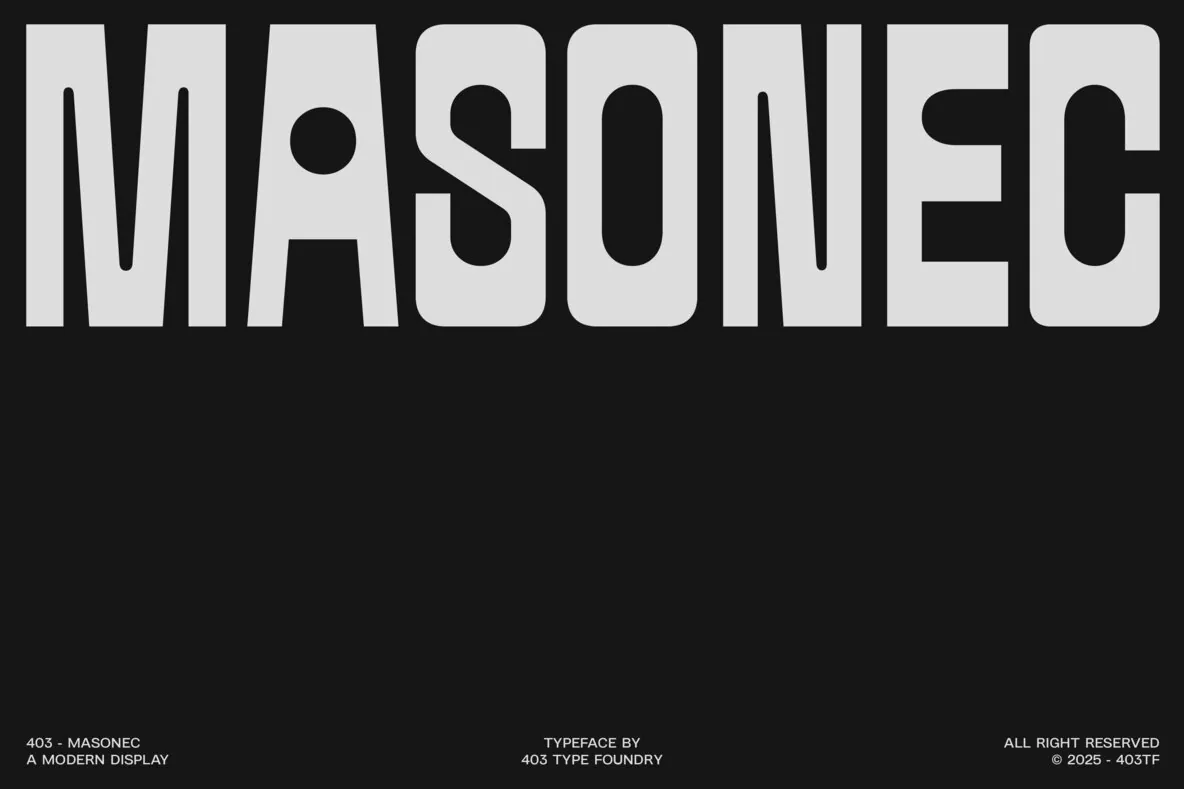
403 Masonec — Brutalism with a Monospaced Pulse
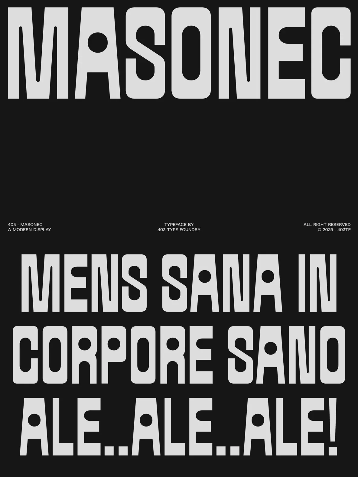
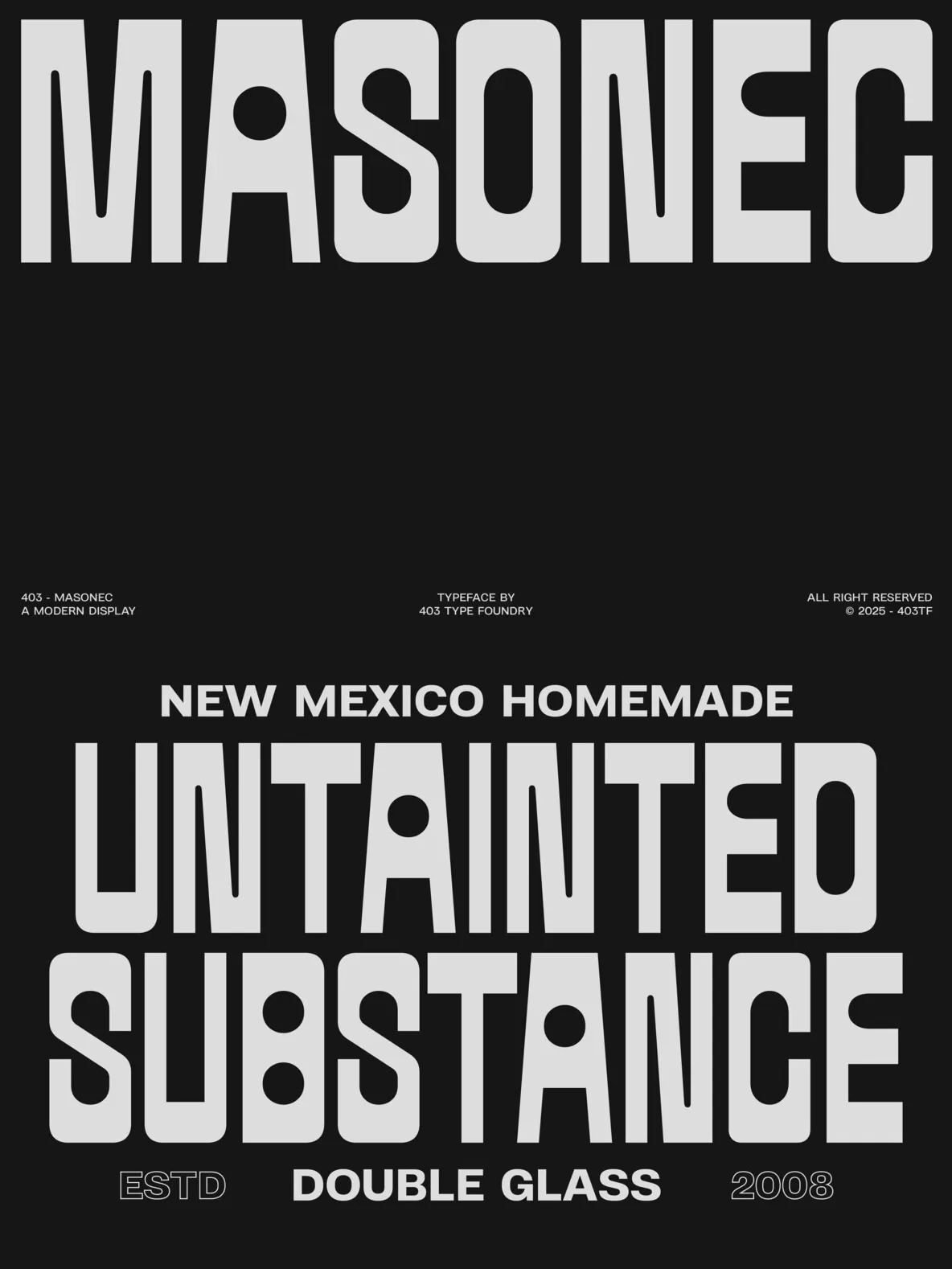
403 Masonec is a display typeface shaped by industrial signage and brutalist architecture. It brings a modular, structured presence that demands attention. Rigid geometry and circular counterforms create sharp contrast, giving clarity without losing density. A steady monospaced rhythm anchors layouts so each letter holds its weight and reads cleanly, even at large sizes.
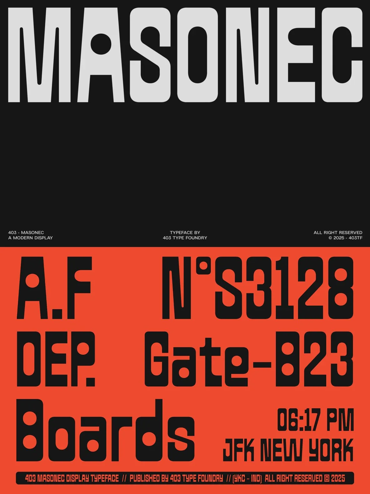
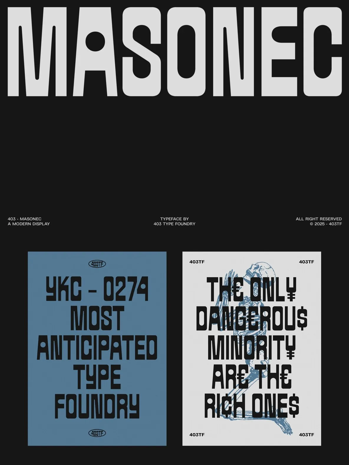
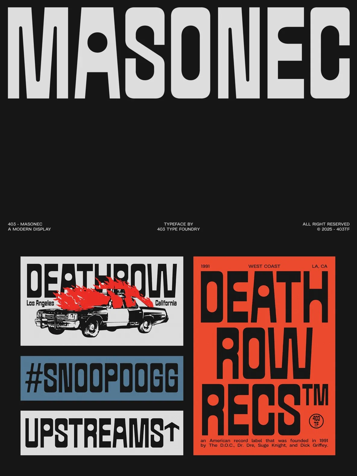
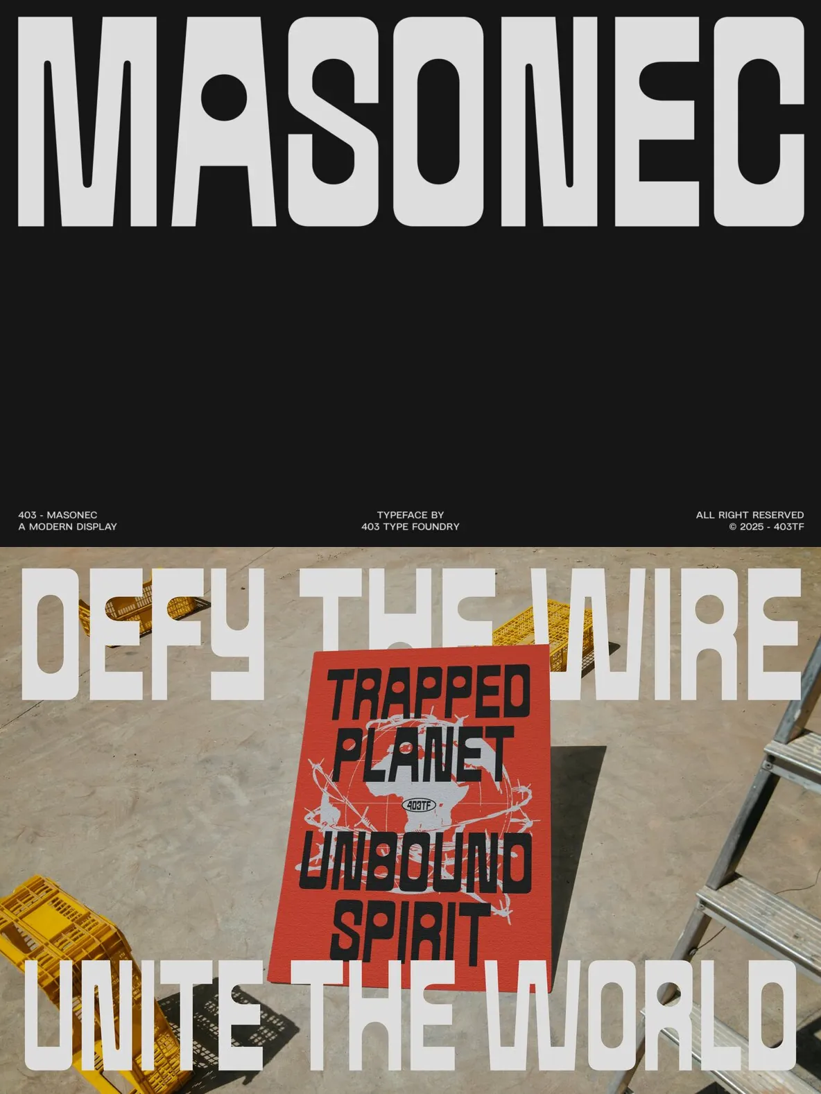
Masonec suits creative professionals who want decisive structure and expressive letterforms. It supports a bold typographic voice across editorial design, transit graphics, music packaging, and sports visuals. Use it for branding systems, magazine headlines, album covers, motion graphics, posters, streetwear branding, apparel, or web hero sections. Its assertive tone prioritizes visibility and recognizability, balancing industrial rigor with playful counterforms across high-impact formats.
Features
Industrial brutalist design with strong visual presence
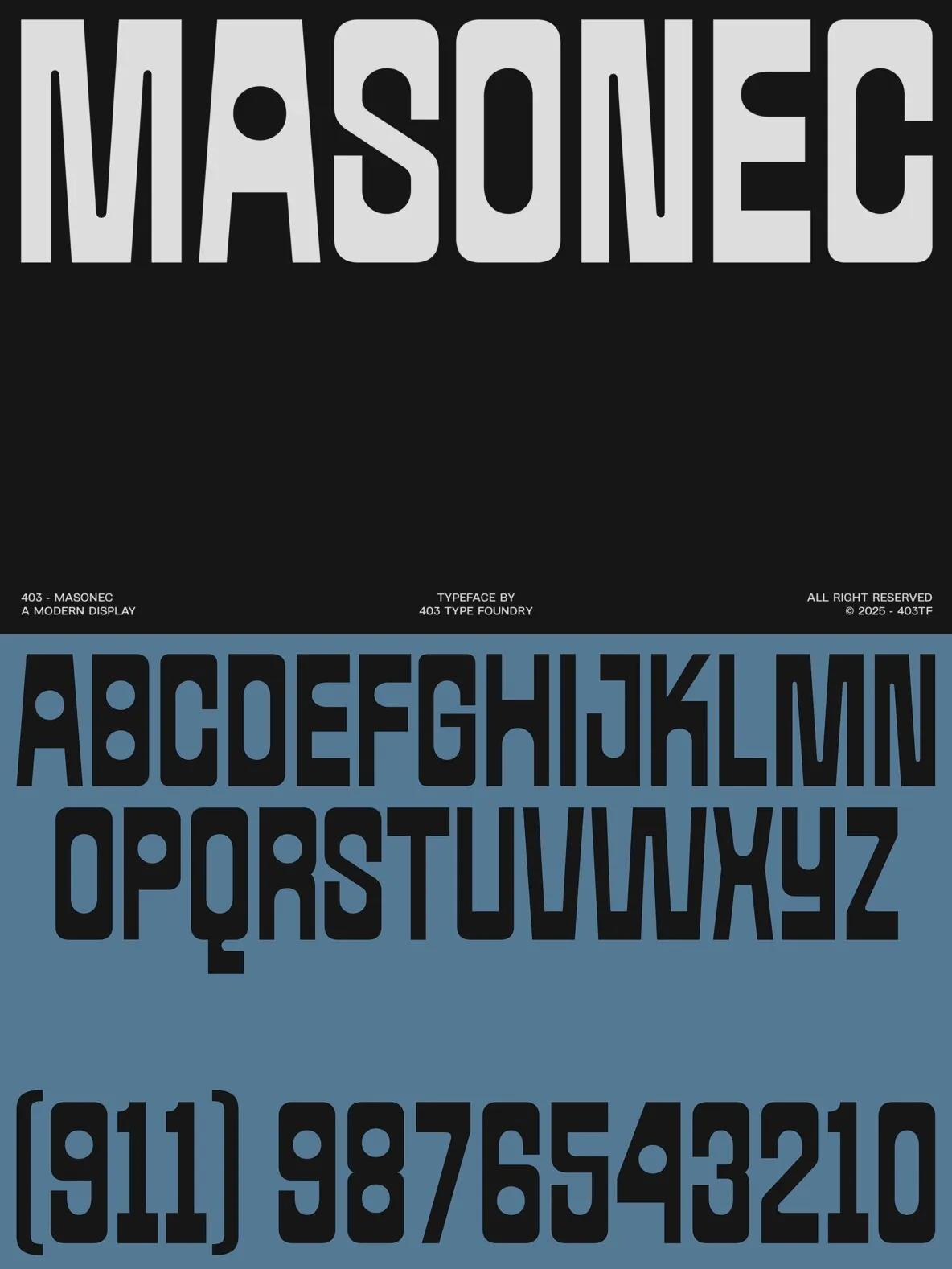
Full uppercase and lowercase set
Two styles: Regular and Slanted
Over 500 glyphs, including support for accents, symbols, arrows, and mathematics
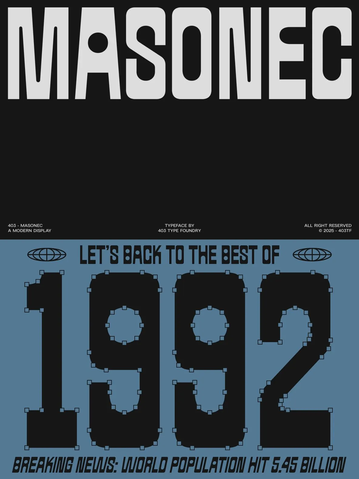
Grid-based vertical construction
Distinct circular counterforms for unique contrast
Retro-futuristic and editorial-friendly aesthetic
Includes numerals, punctuation, and symbols
Supports up to 270 Latin-based languages
Ideal for branding, posters, album covers, apparel, web headers, and editorial applications