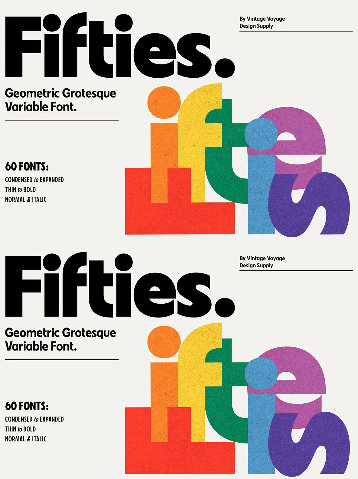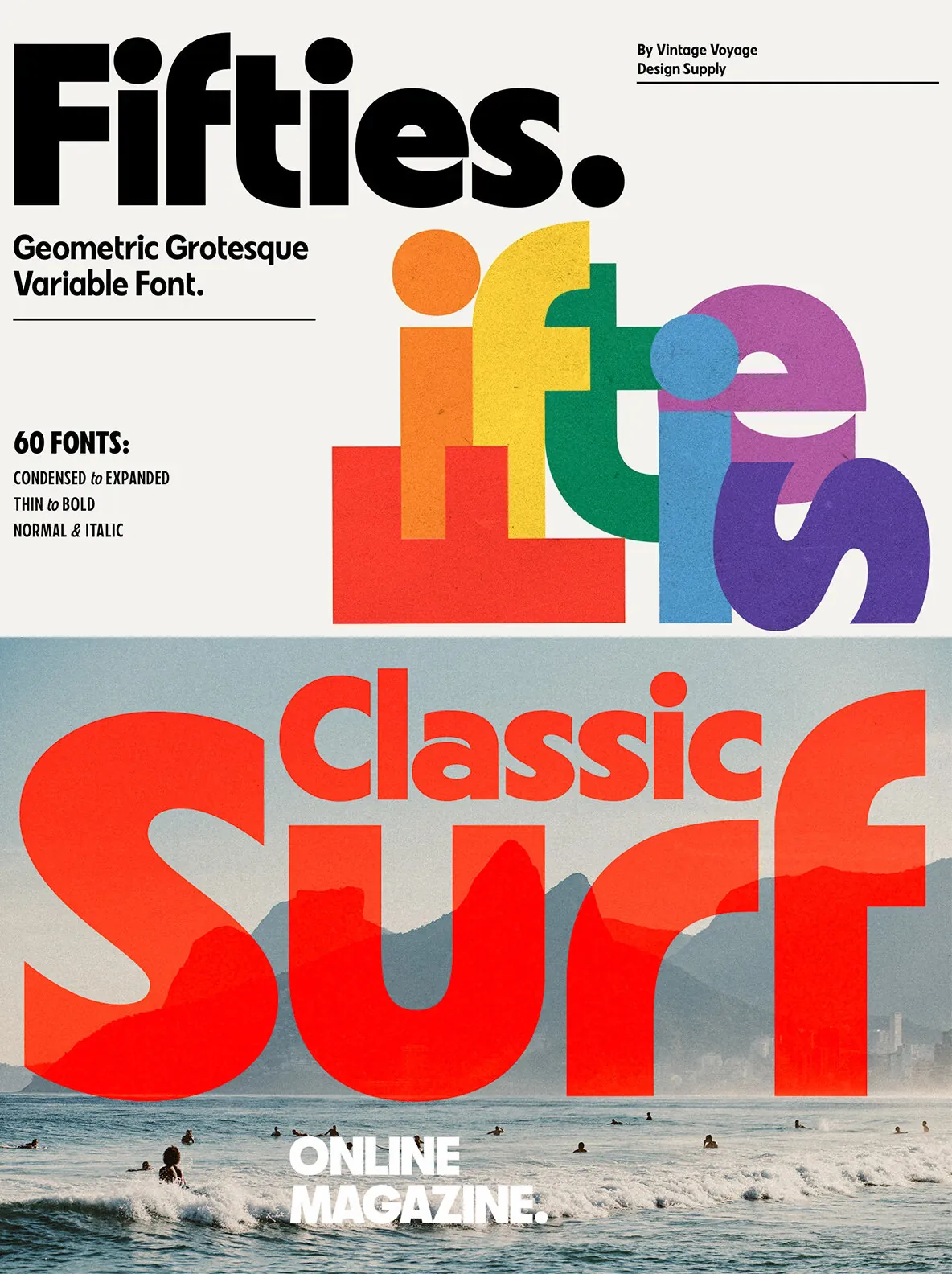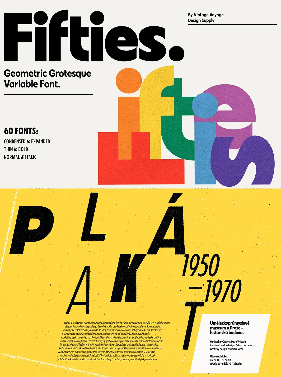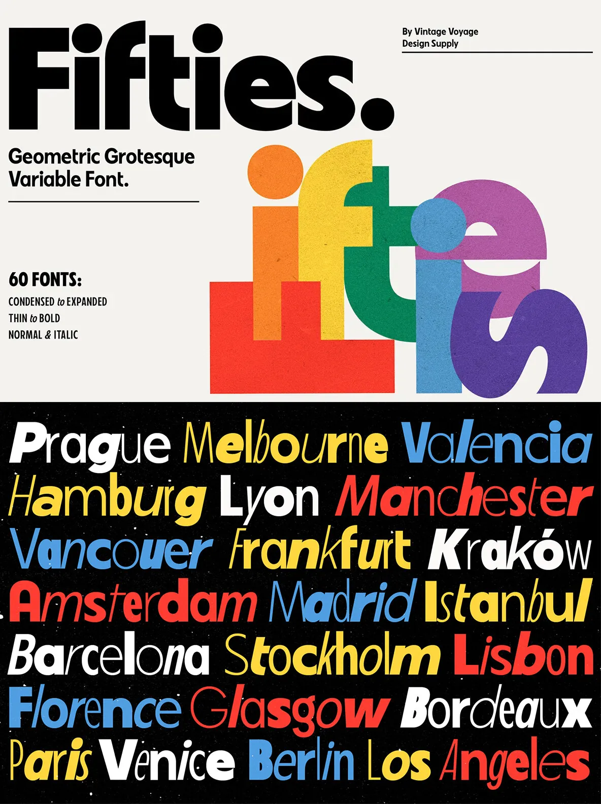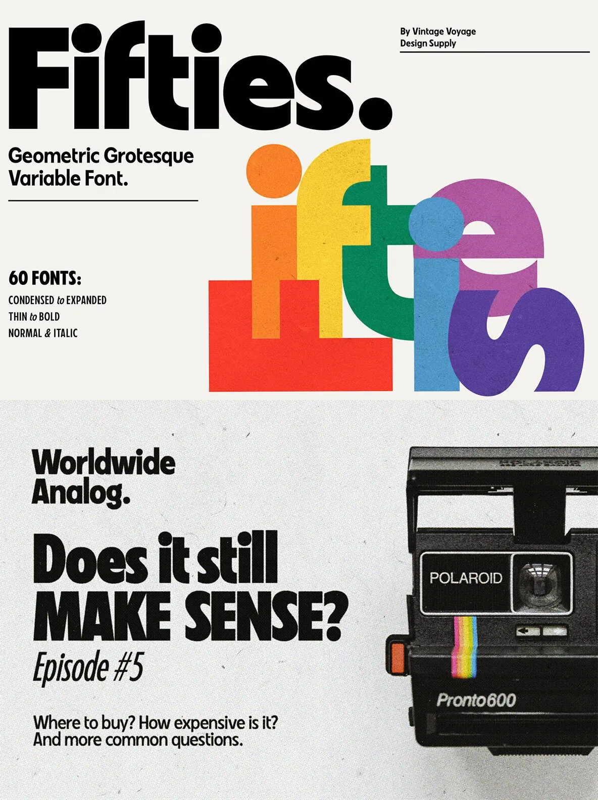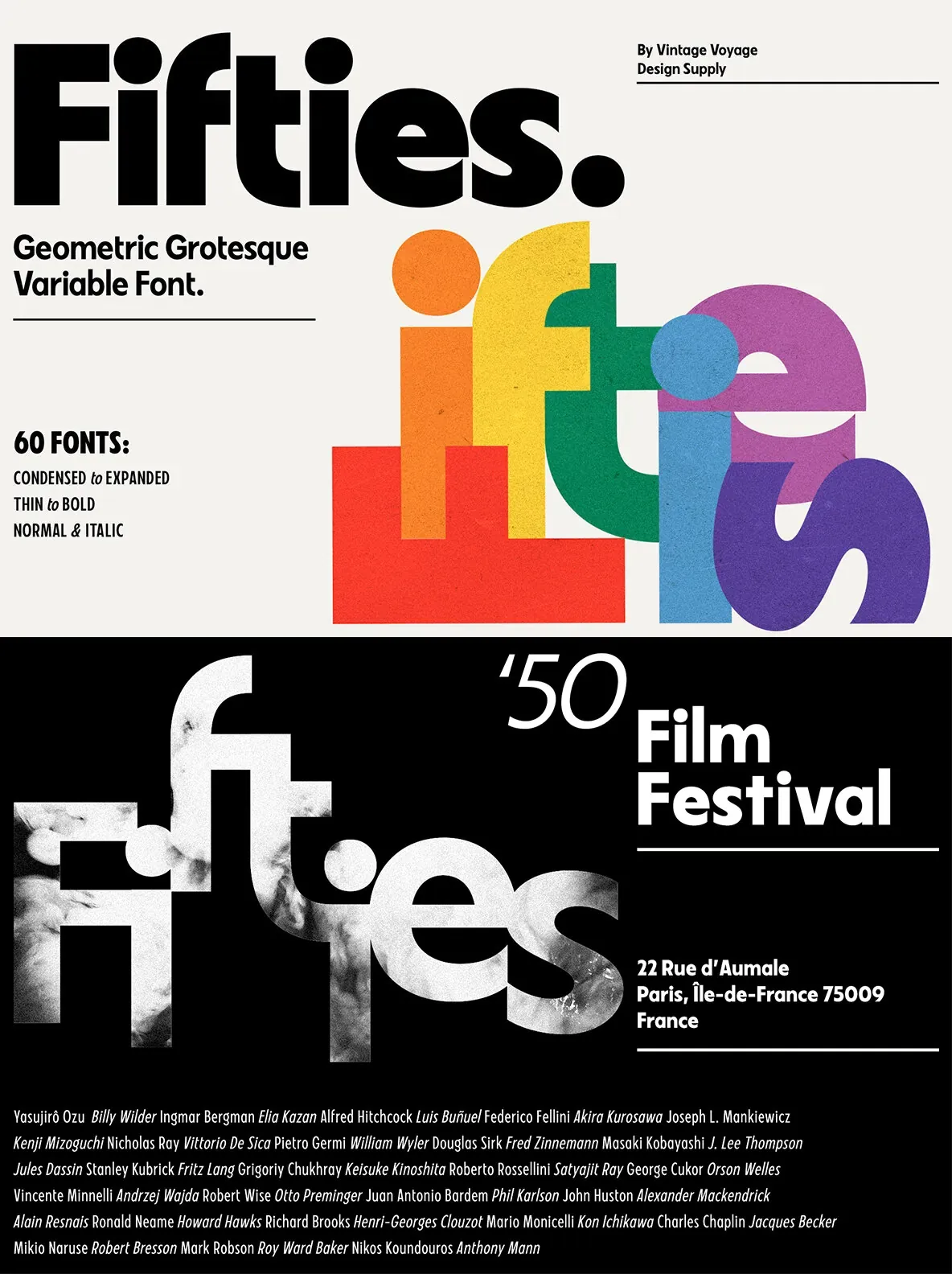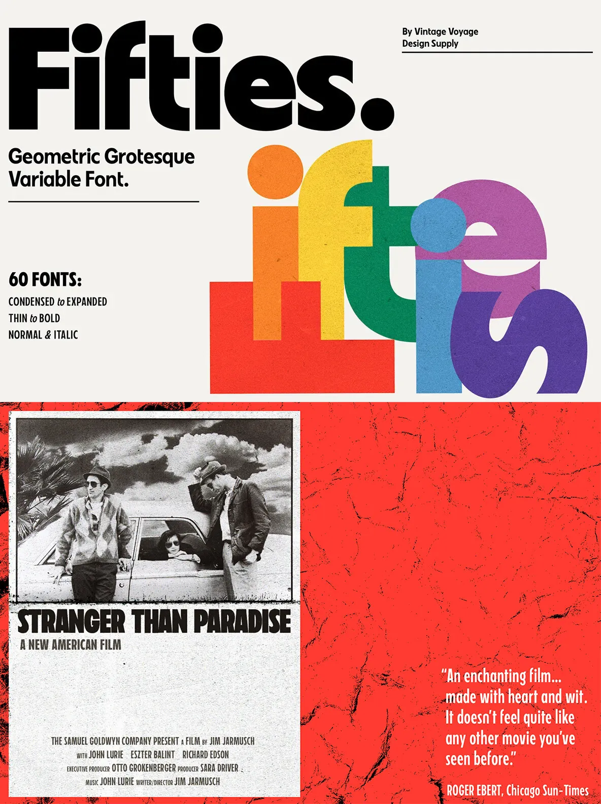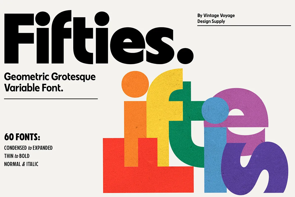
Fifties: Classic Geometry Meets Humanistic Grotesque
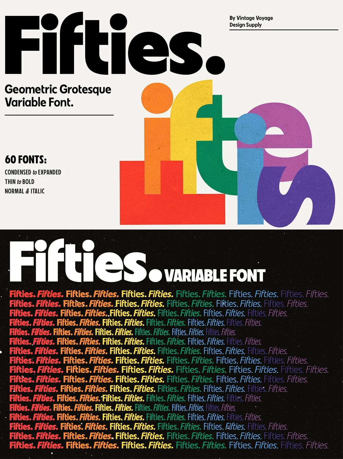
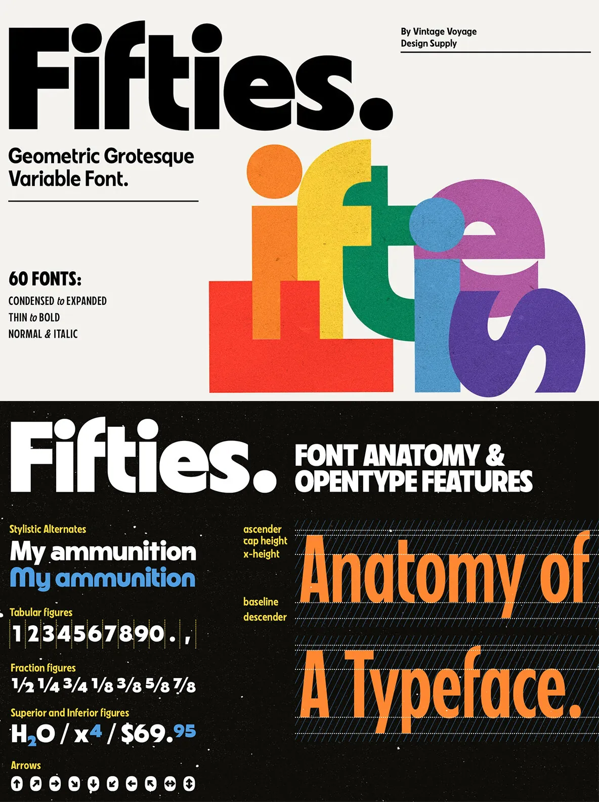
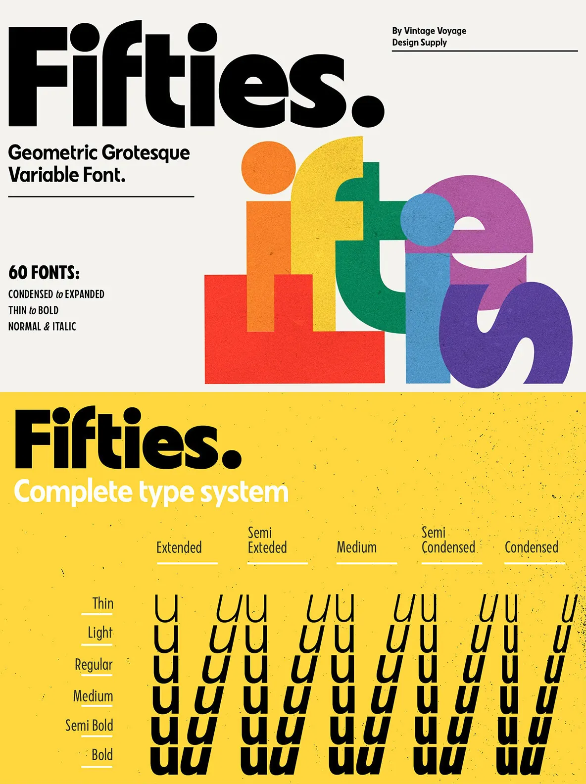
Fifties blends classic geometric forms with subtle humanistic details, resulting in a versatile typeface that recalls the aesthetics of 20th-century Modernism. Designed to connect the present with the enduring style of the past, this font brings the timeless clarity and tactile warmth found in mid-century European design.
Balancing bold geometry with soft, approachable lines, Fifties is well suited for editorial projects, branding, and contemporary graphic work. Its carefully considered proportions offer both reliability and character, making it an effective choice for designers who value both form and function.