Aigo Mono: Structured Monospace Serif for Precision
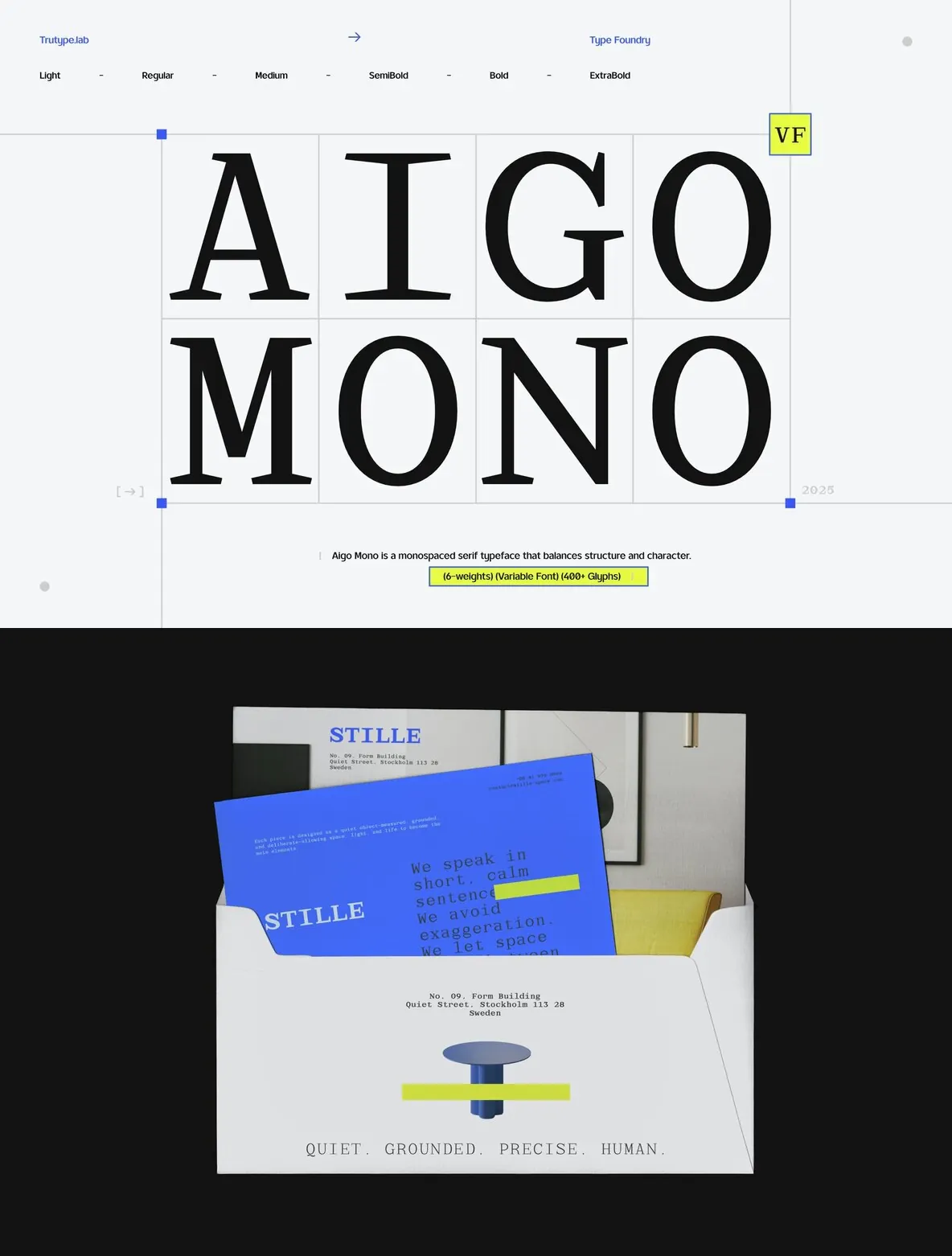
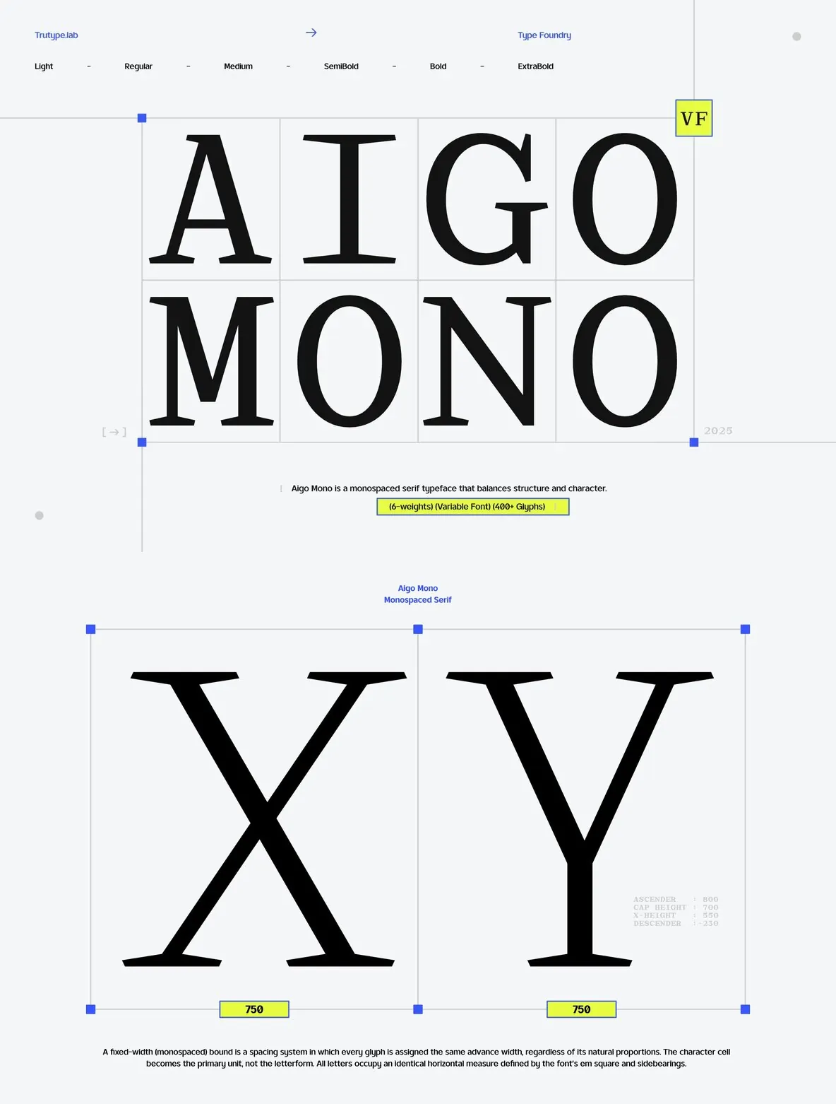
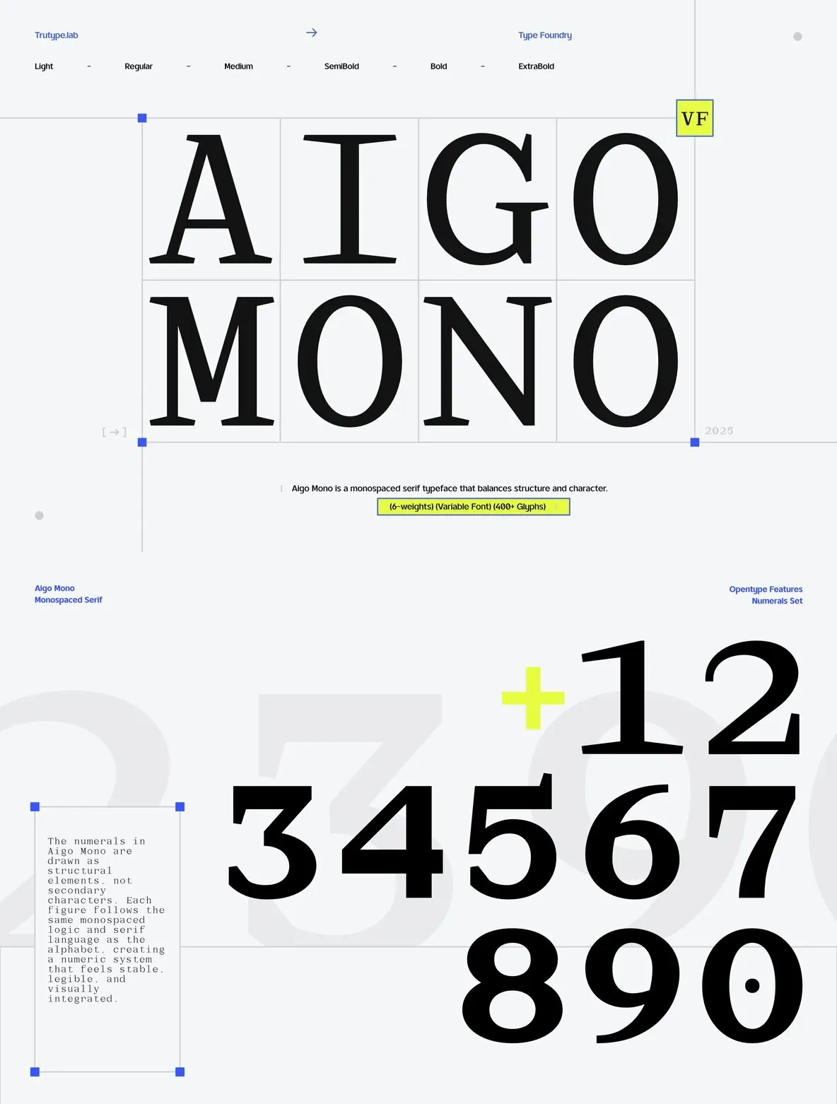
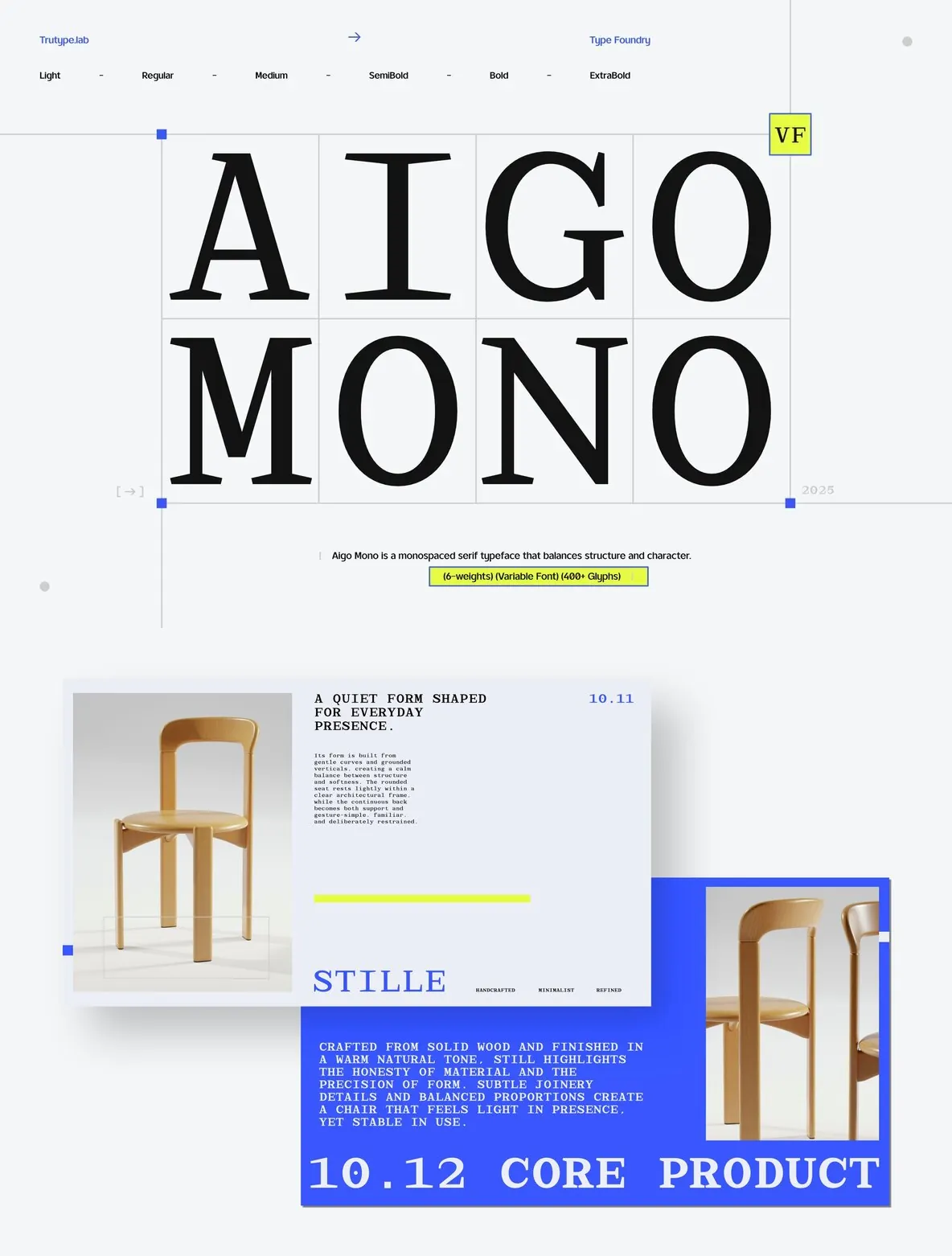
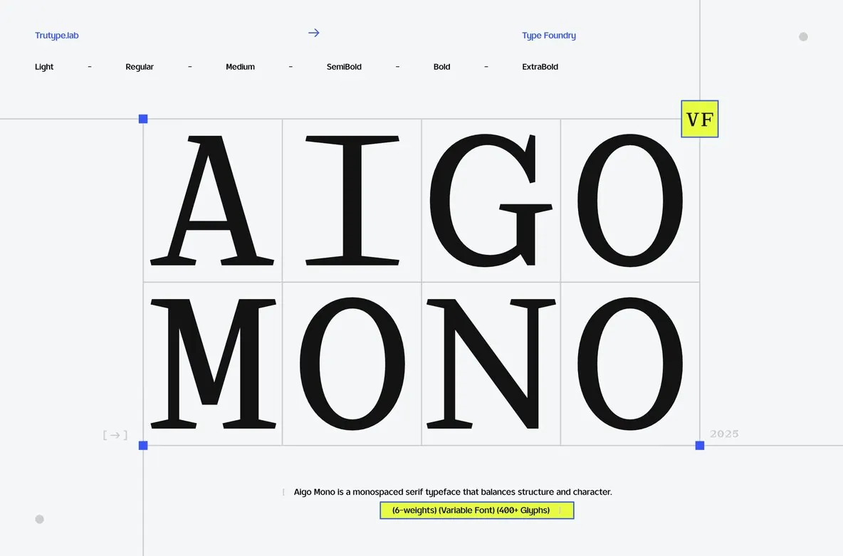
Aigo Mono is a monospace serif typeface defined by structure, rhythm, and typographic discipline. Its equal-width letterforms create a consistent grid, enhancing clarity and order in complex layouts. This makes it particularly suited for systems-driven design where precision is paramount.
The serif details add a subtle character and warmth, softening the inherent rigidity of monospace fonts without diminishing legibility. This balance challenges the perception of monospace type as purely utilitarian.
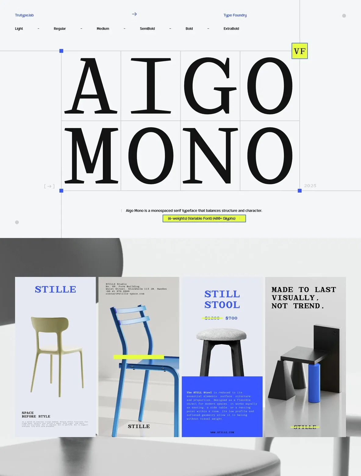
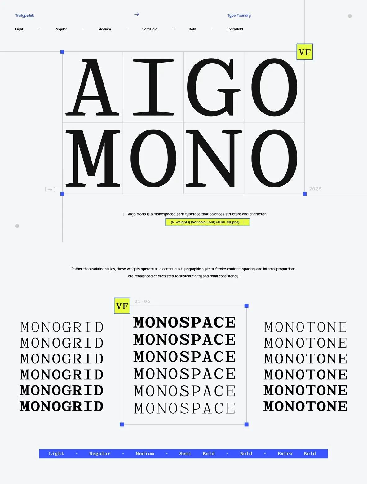
With carefully balanced proportions and multiple weights, Aigo Mono adapts fluidly across editorial layouts, user interfaces, and experimental compositions. It maintains coherence while supporting diverse design approaches.
Designed for professionals who prioritize precision and uniformity, Aigo Mono delivers a voice that is modern yet composed—functional without sacrificing expression, and structured yet versatile.