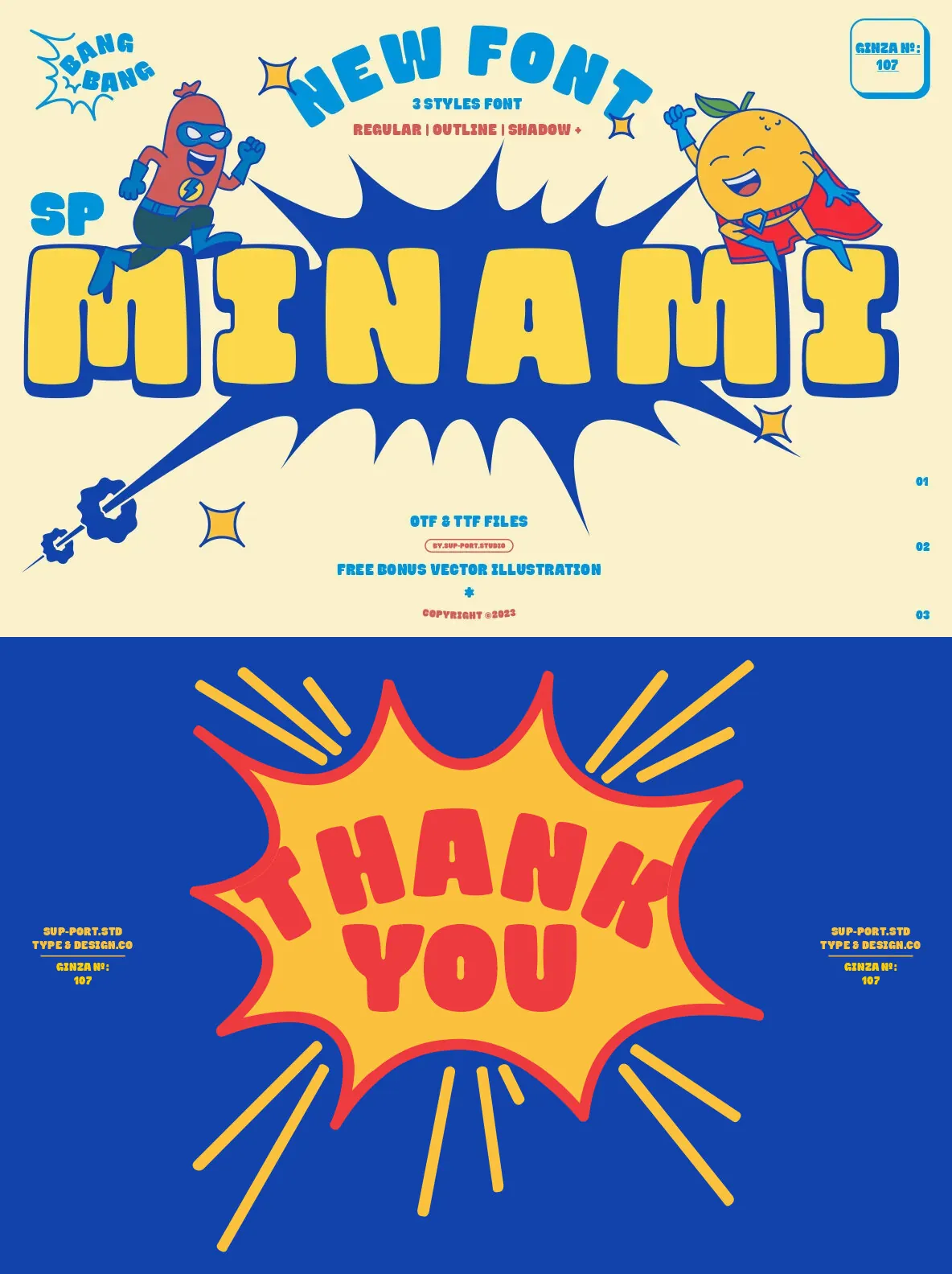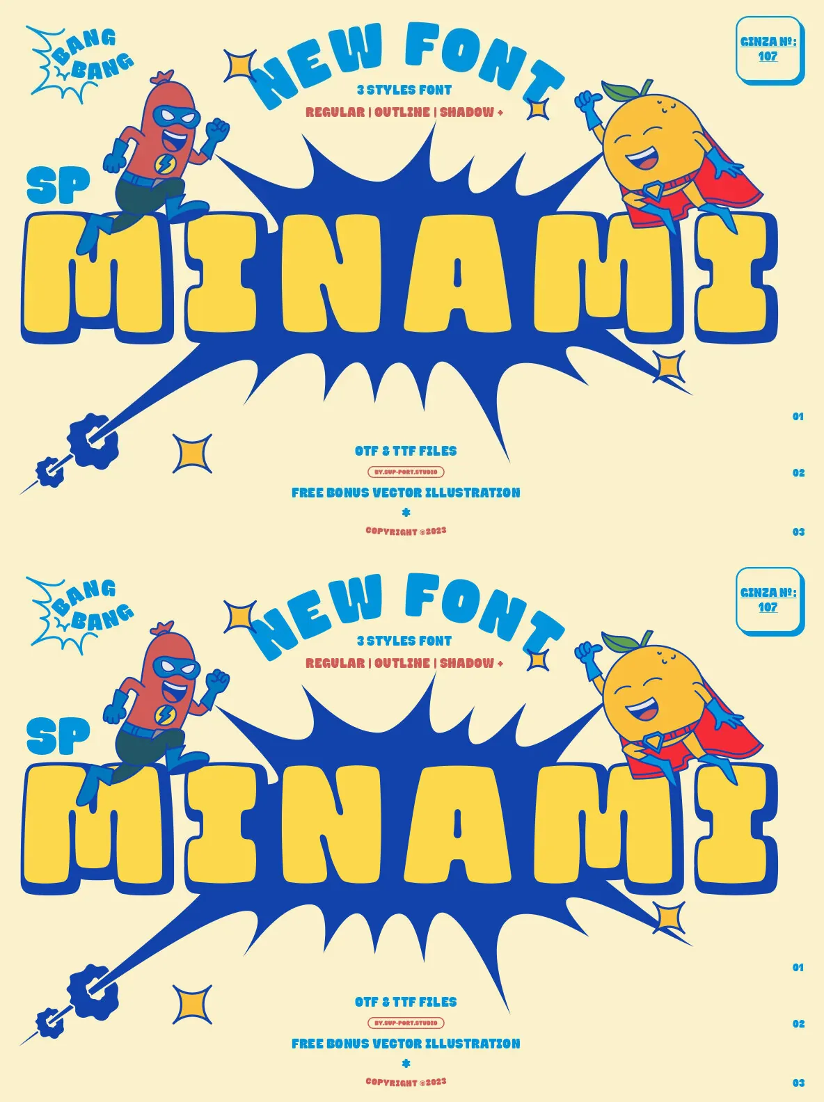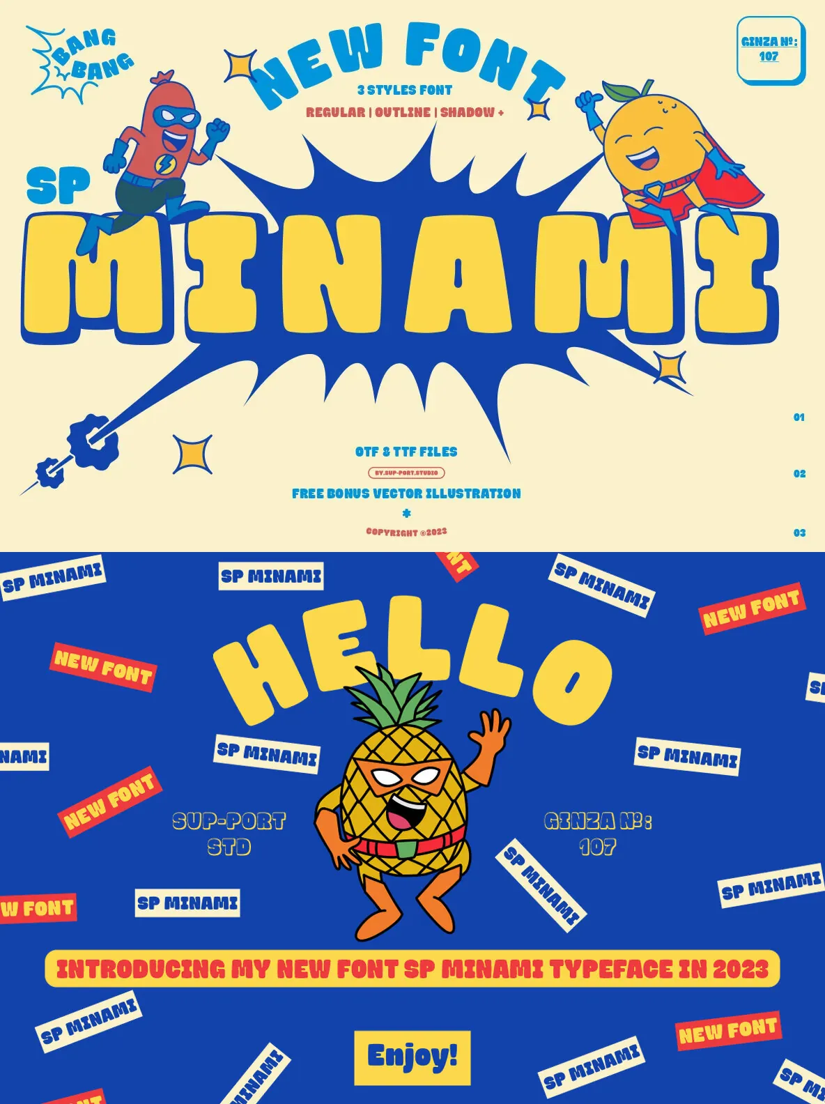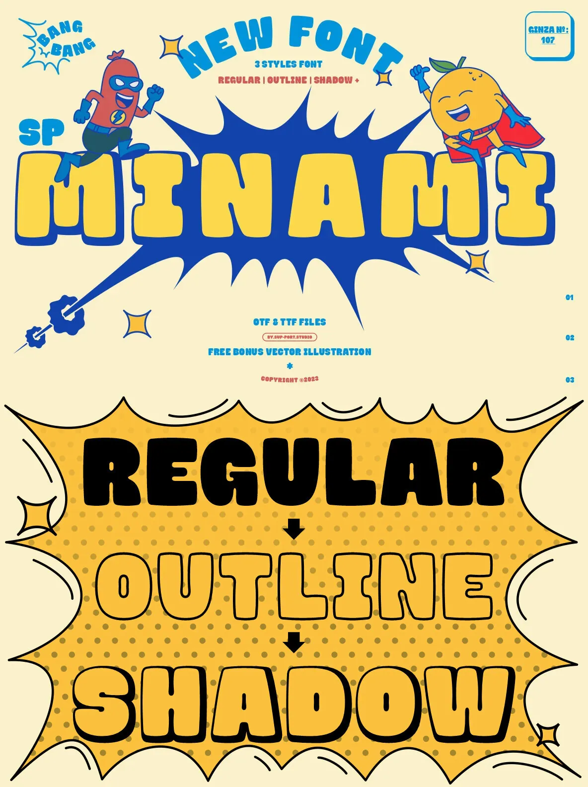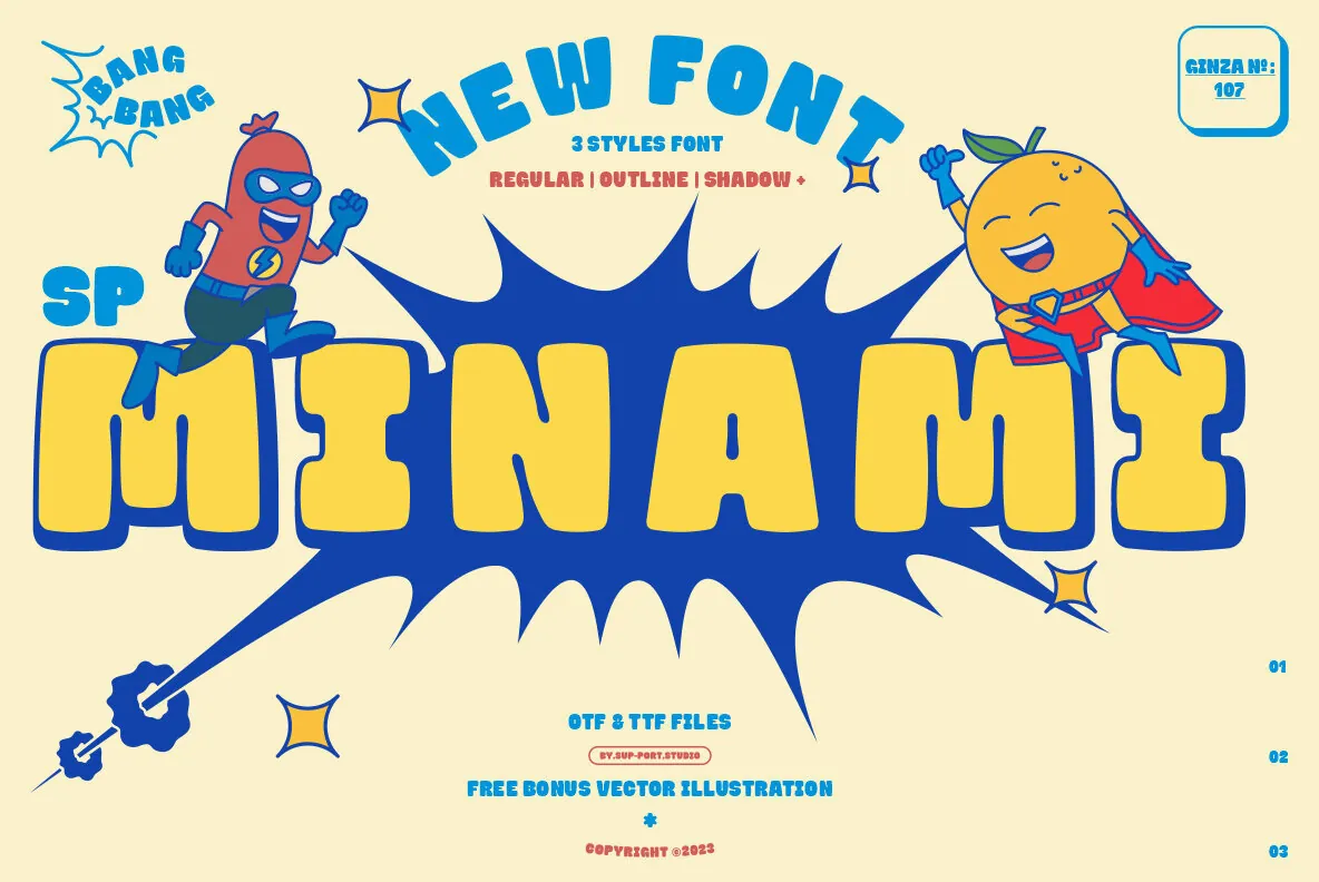
SP MINAMI — Retro forms, clear presence
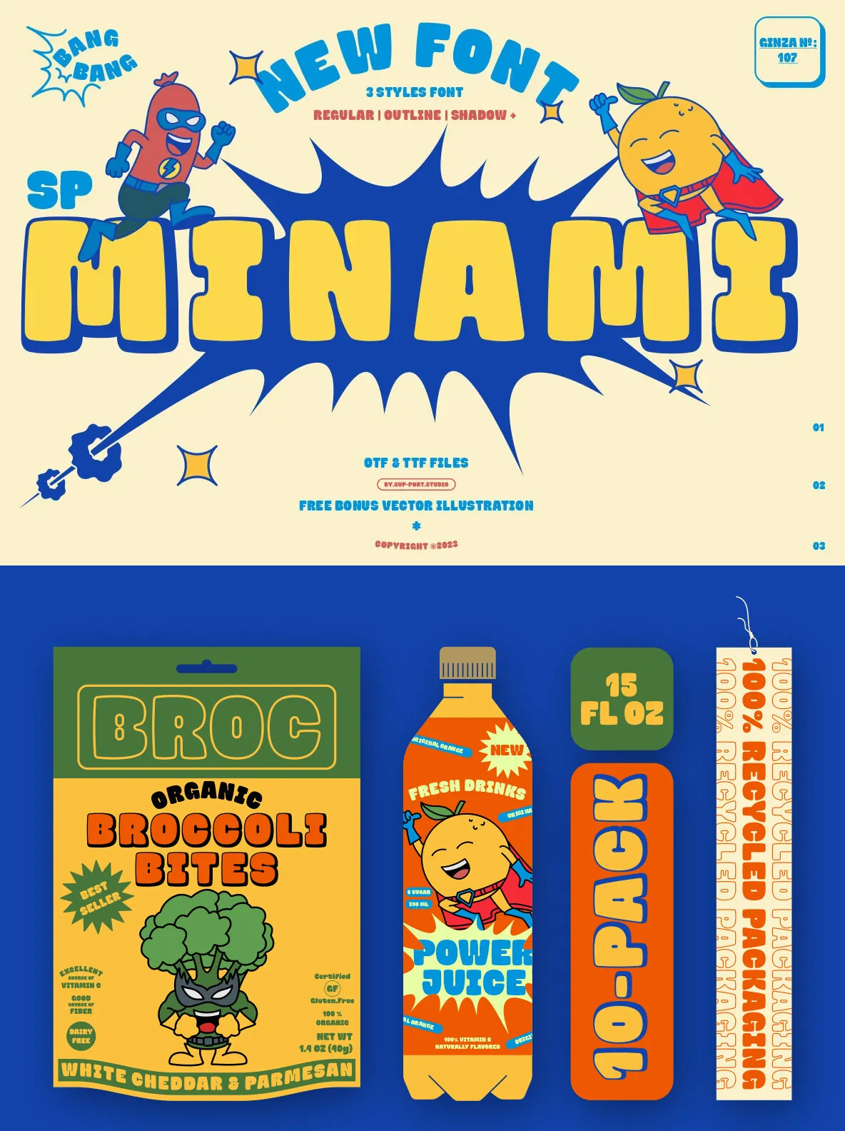
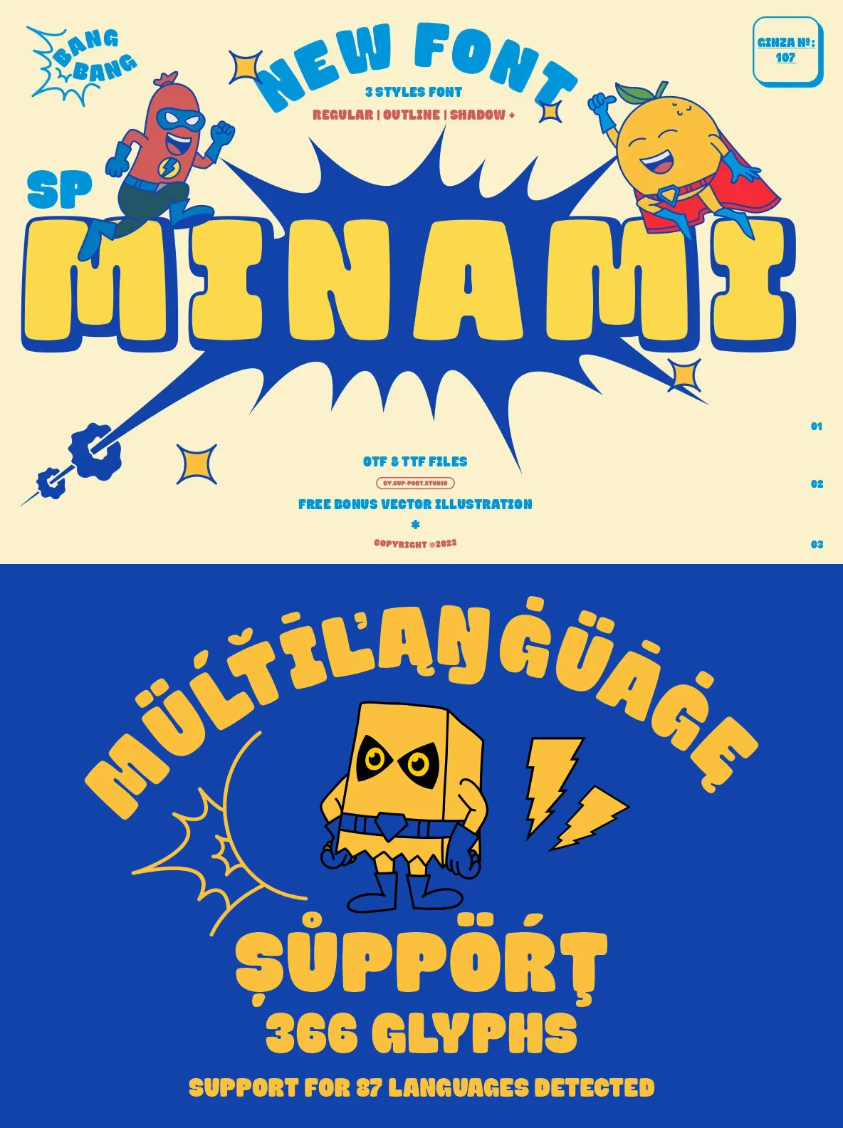
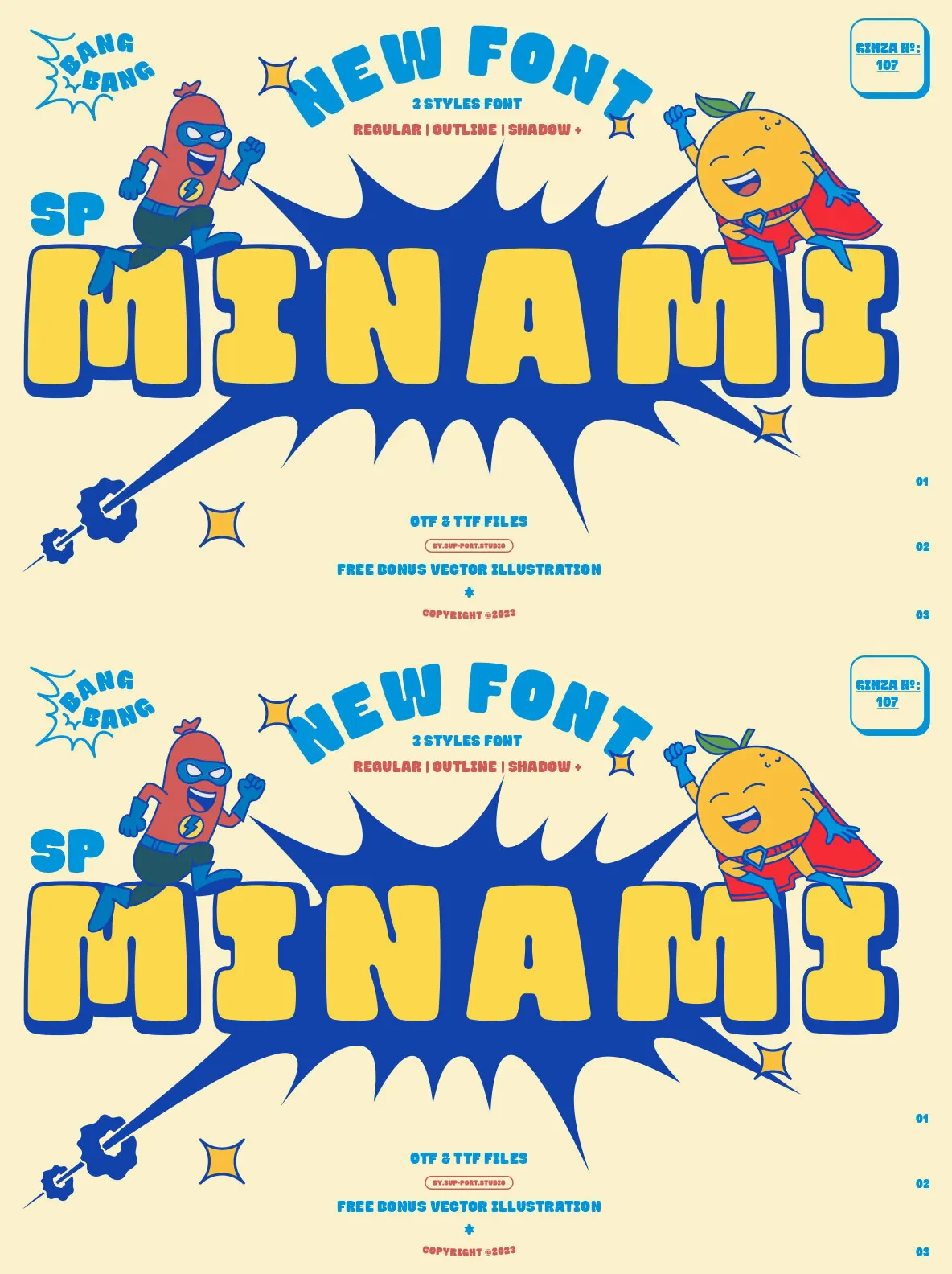
A retro font design published by Sup-Port Studio. SP MINAMI brings a nostalgic tone that reads cleanly on screen and in print, making it a strong choice for branding, posters, packaging, and editorial layouts.
Designed to fit design-led projects that call for a distinct vintage voice, it works well where you need character without sacrificing clarity. Use it for headlines, logotypes, and short text where letterforms should do more than simply carry content.