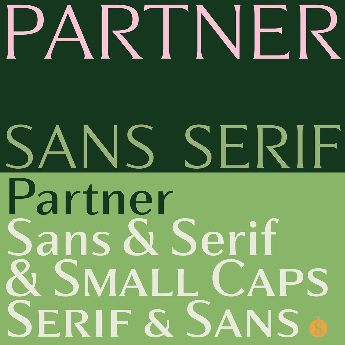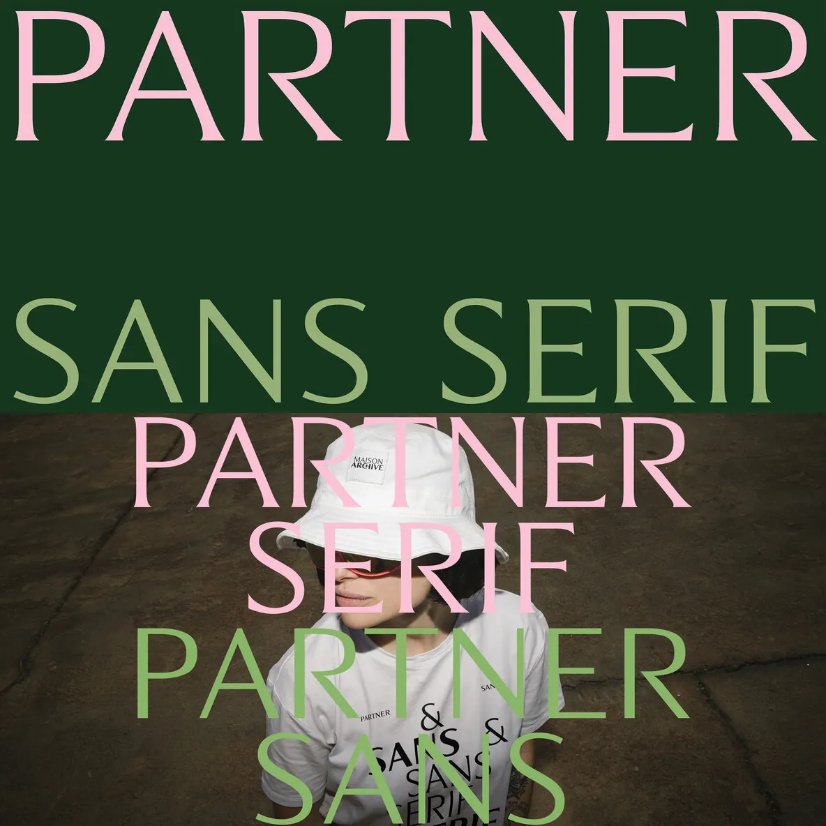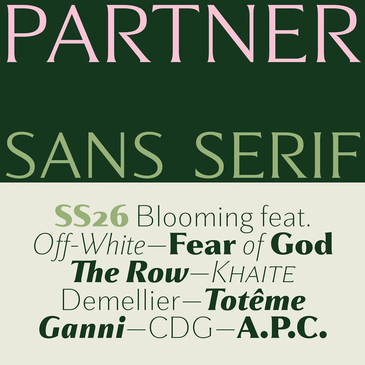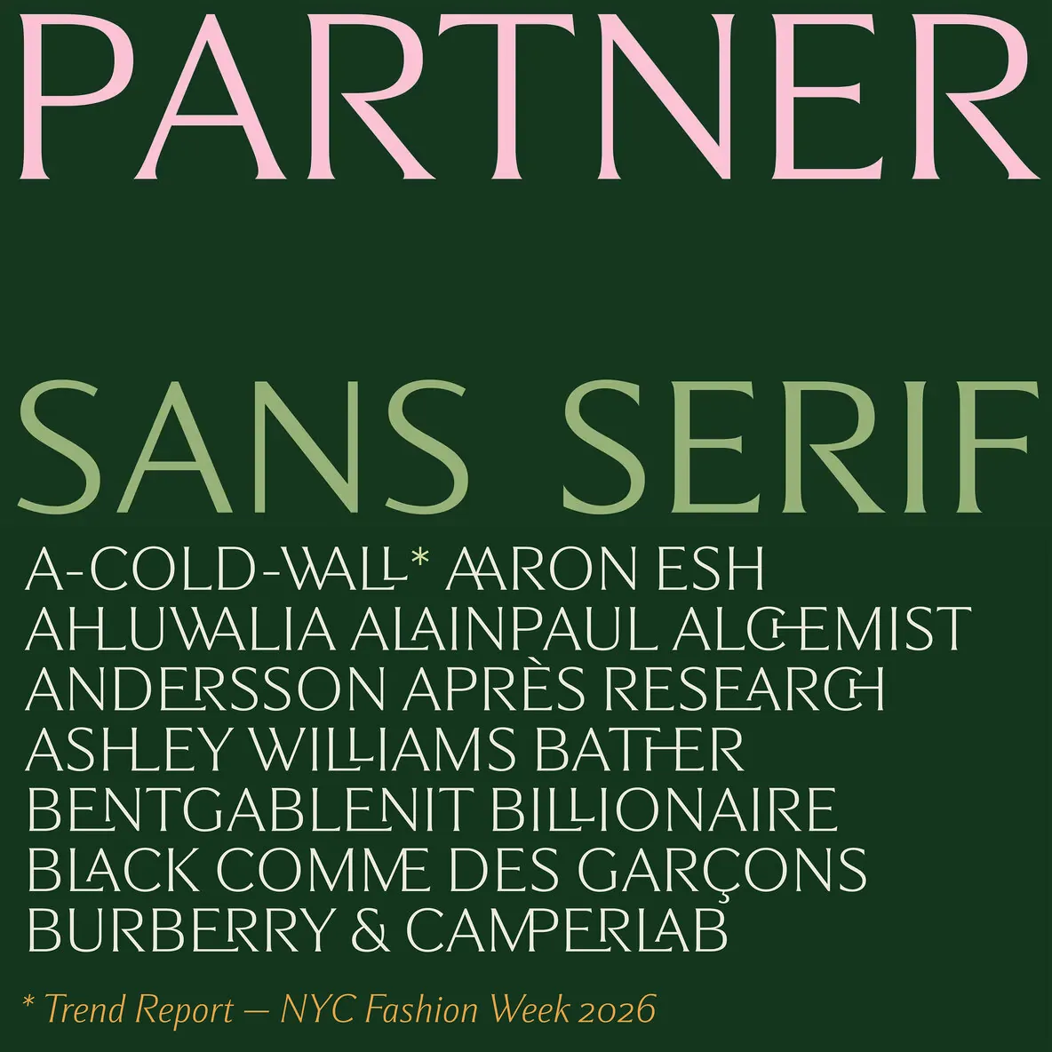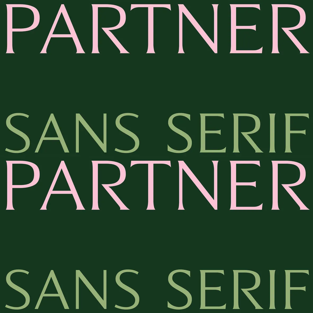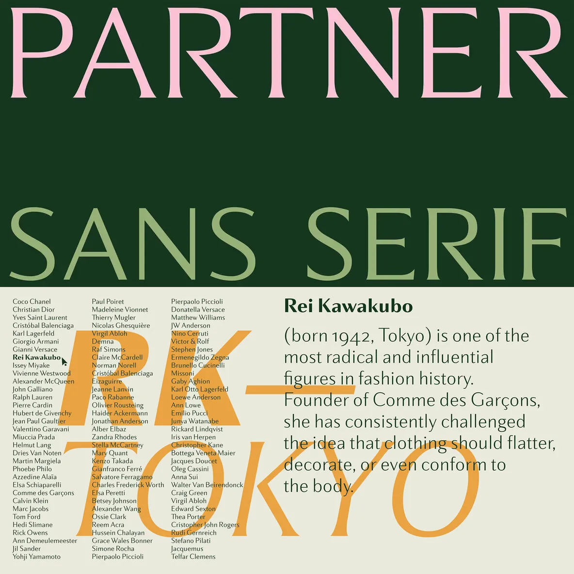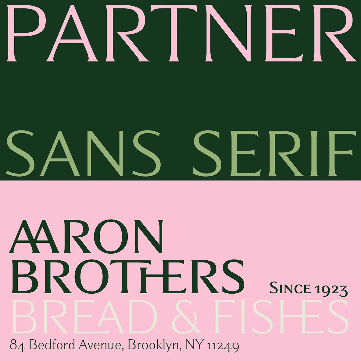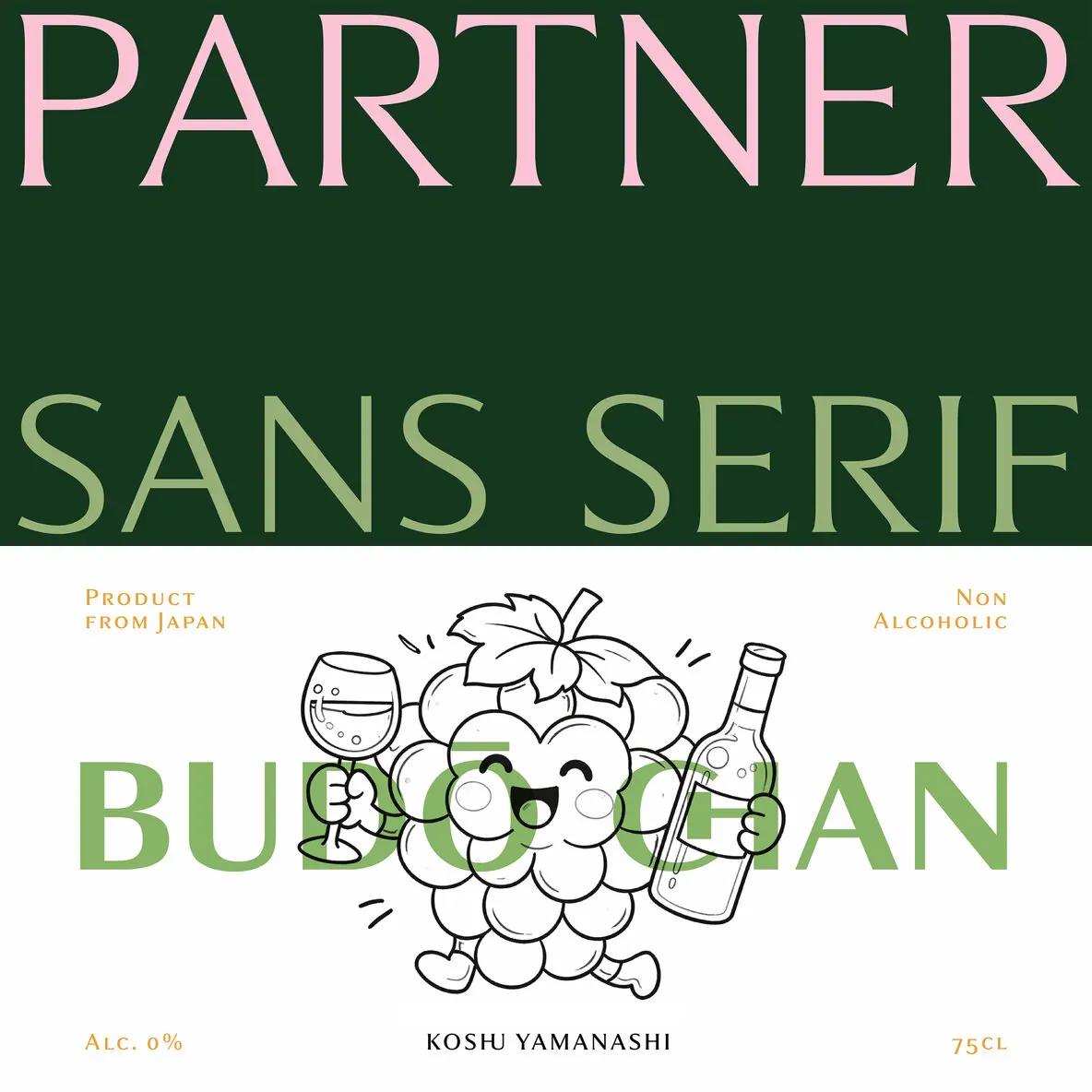
Partner — One Voice, Many Registers
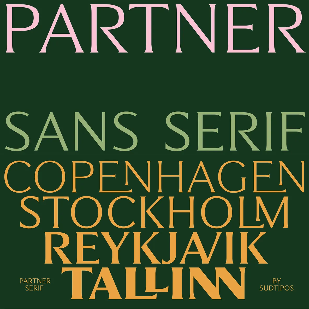
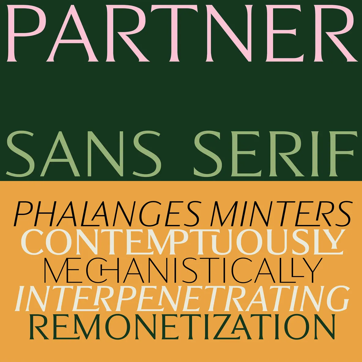
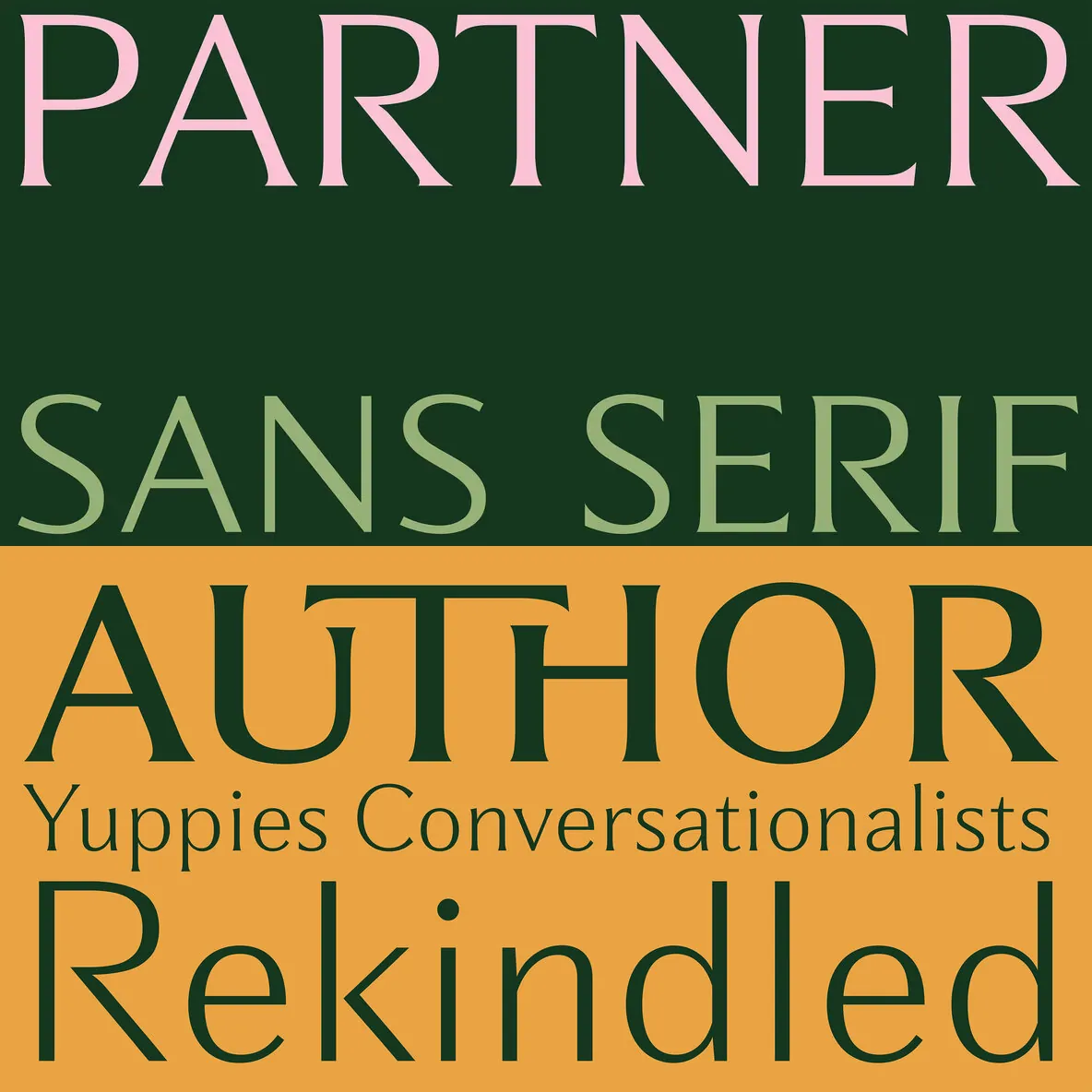
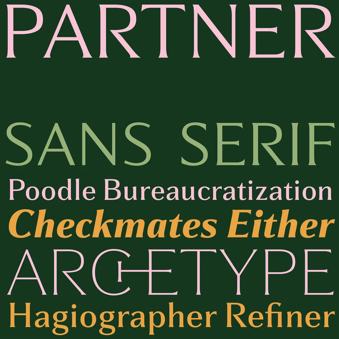
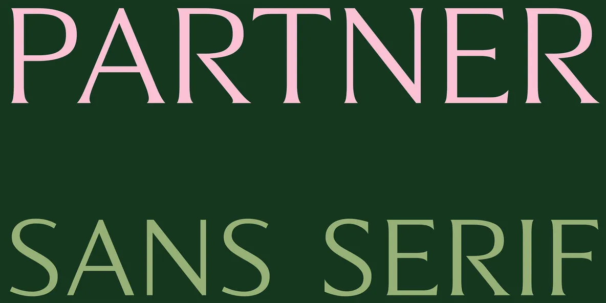
Partner is a variable type family shaped by a specific working context: a custom commission for a neo-bistro in Argentina, where technical rigor needed to read as welcoming on menus, signage, and printed matter. That origin shows in the typeface’s practical clarity and steady rhythm. Partner starts as a straightforward sans serif, then extends into a broader system that moves continuously between sans and serif, and from light through black.
As the family expanded from early restaurant use into a full range of weights with true italics, one idea stayed constant: preserve the underlying structure while allowing it to evolve into a serif without breaking the logic of the letterforms. The incised serifs add texture and tension without period pastiche. Along the axis from sans to serif, Partner shifts from utilitarian to more editorial, staying composed under close reading and scaling from small text to display.
Features
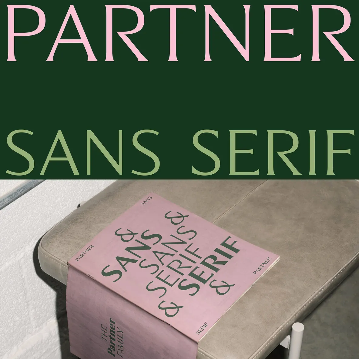
Variable axis that blends sans and serif within one family
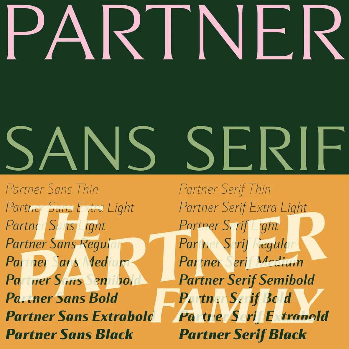
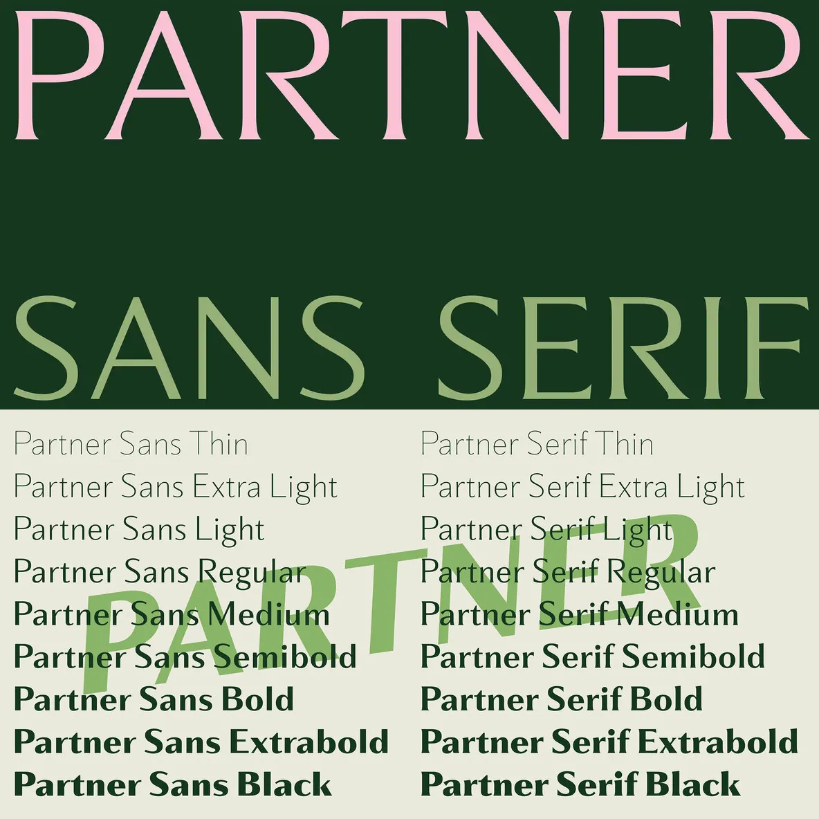
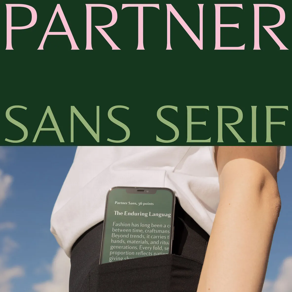
Weight range from light to black with true italics
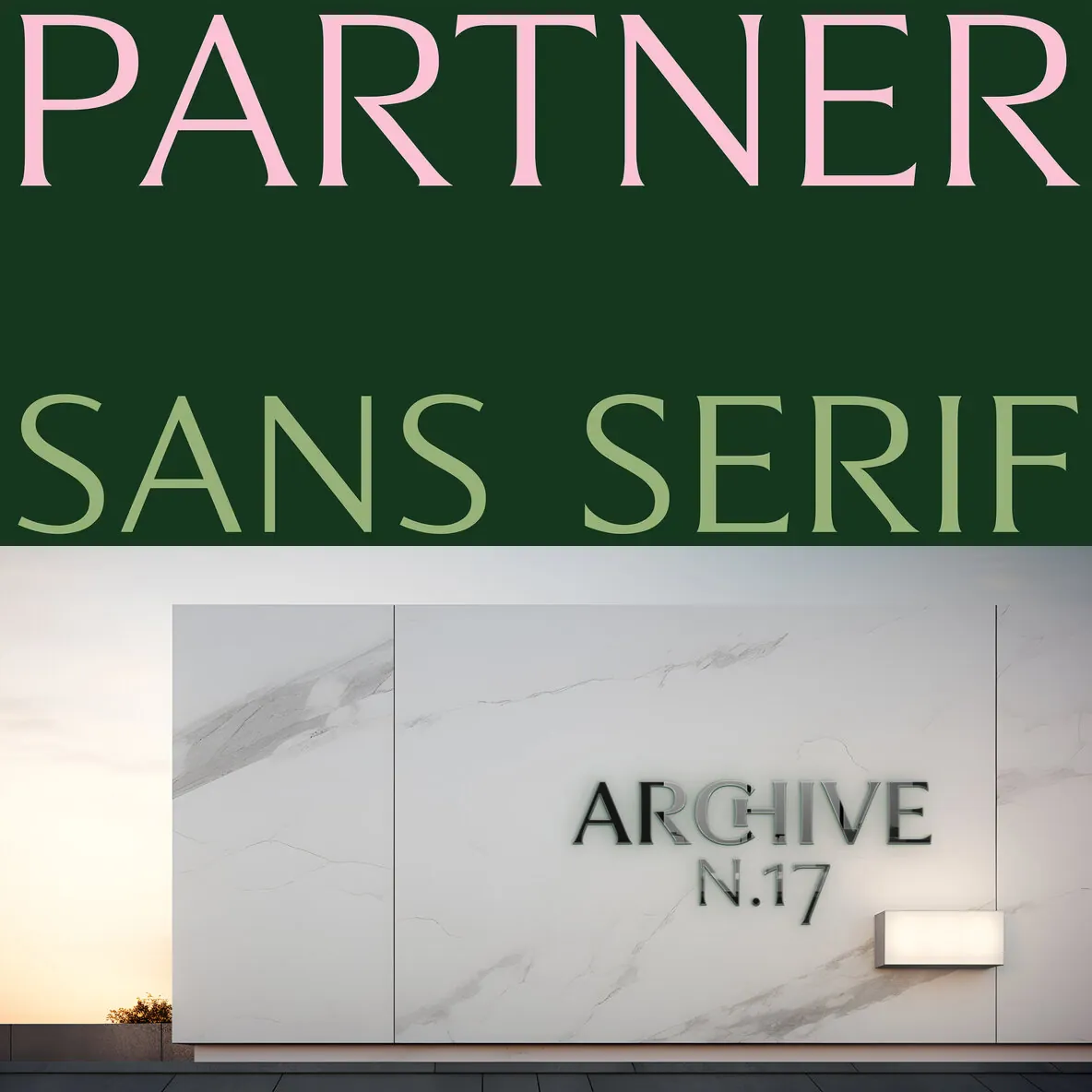
Incised serif construction for added texture and sharper articulation
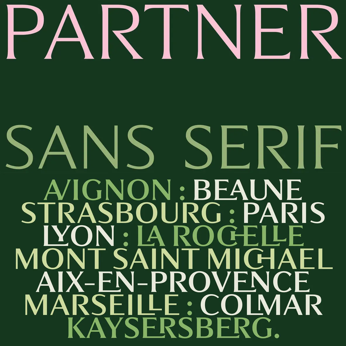
Connected uppercase set for an alternate rhythm and more expressive titles
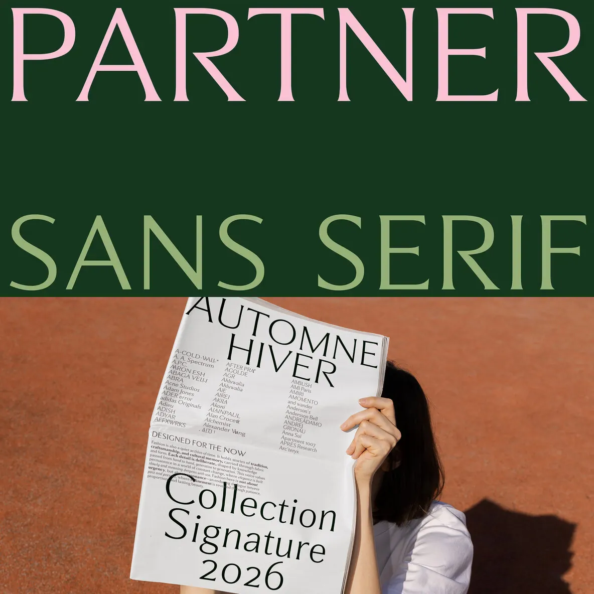
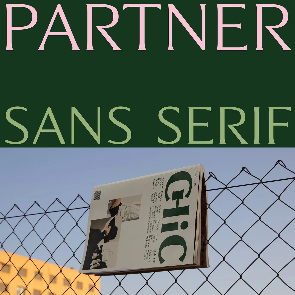
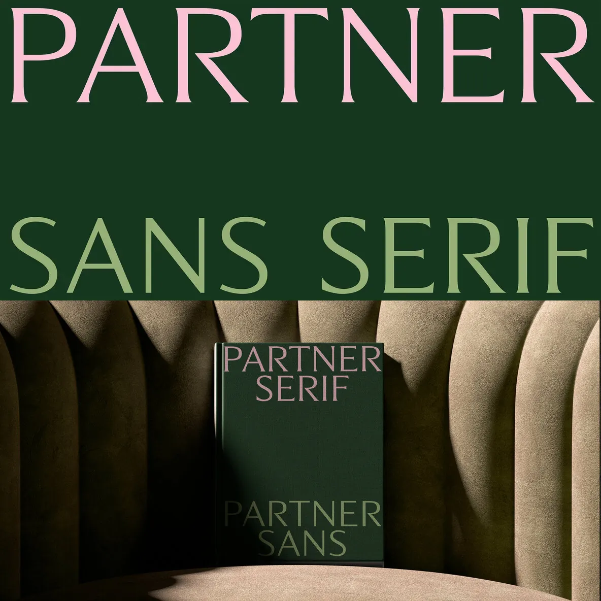
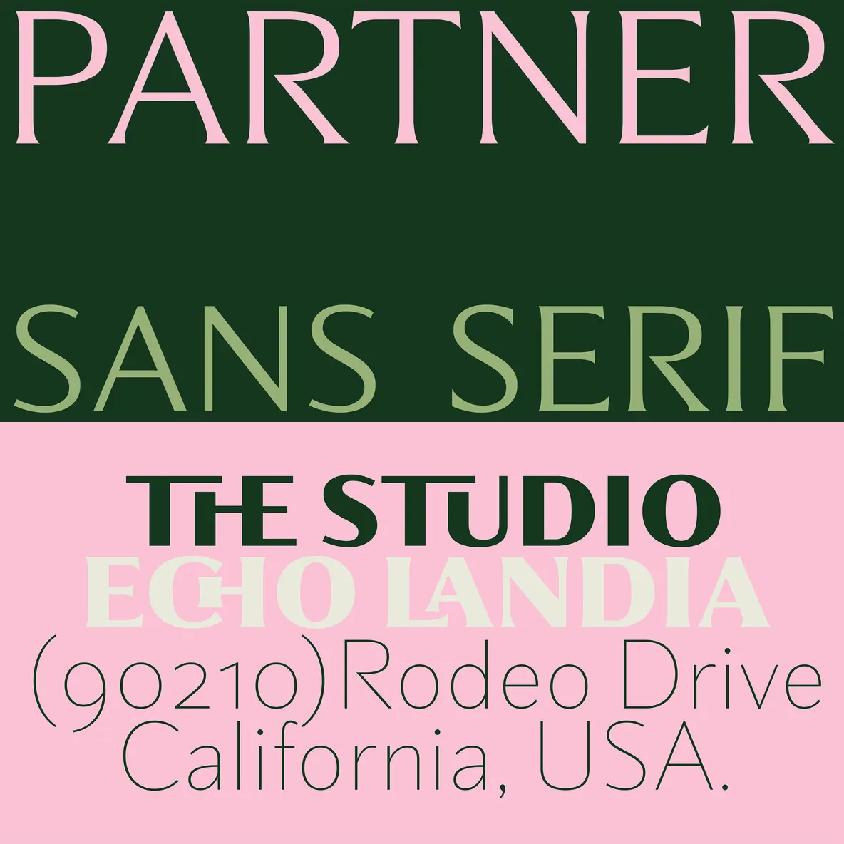
Designed for brand identities, editorial layouts, menus, packaging, and cultural print
Partner draws from the overlap of graphic design, fashion, and 20th-century visual culture, yet reads as current: classic without stiffness, modern without excess. It suits projects where form carries narrative—gastronomy, fragrance, fine beverages, books, and magazines—especially when you need a single variable font family that can move between functional clarity and editorial tone. Used thoughtfully, Partner keeps typography present but not performative, giving art direction a clean foundation and a controlled range of expression.